Showing posts with label flickr. Show all posts

How to Add Social Media Icons to your Blog


As I mentioned in the previous post, I was inspired and energized by the most recent Blog Podium.  I am not quite ready to rush out and book advertisers, but I am making some changes with that possibility in mind.  One of the points made at Saturday's session that stuck with me was the importance of having a professional-looking blog.  I have started compiling a list of blogs that I feel strike the right balance between personality and professionalism for inspiration.  For me, this means above all clean, un-cluttered, organized, and easy to navigate.

Another important piece of advice was to stay well-connected to the community you are in and be able to demonstrate that you have your own little niche of expertise.  Blogger makes it easy to link up to your other social networking profiles with widgets and gadgets in your blog's sidebar, and I already had many of them in place.  However, I love the look of a simple self-explanatory row of icons, so over the past couple of days I added this at the top of my sidebar:

It connects readers directly to a whole bunch of my other profiles but uses a minimum of real estate.  Win-win!  It was easy enough to do, but I ran into a few snags, so I thought I would outline the process here in case anyone else wanted to do this as well.  (There are many other tutorials out there if mine is confusing!)

1.  Find your favourite icons, or make some yourself in Photoshop and save as a .png file.  I got mine from the lovely Carrie Loves blog, where she has a ton of colours.  Isa Maria of The Academy also did a lovely series based on the Pantone colours of the year.  For MANY more options, you can google "Social Media Icons."  Once you find the ones you want, save them to your computer.
2.  Upload your png files to Flickr or Photobucket.  I didn't want these to show up in my Flickr stream, so I signed up for Photobucket and highly recommend it!  To get the URL for each image, which you will need later, you just need to hover over the image and then click on "Direct Link" which makes it super easy.  I will definitely be using Photobucket again!
I ended up uploading my icons three times, because the size I downloaded from Carrie was much too big and it took me a couple of resizes in Photoshop to get the size I liked!  You may want to start with one to see how big it is and then adjust them.  In the end mine were 28 pixels x 28 pixels.

3.  Add HTML gadget to your layout.  To do this, look up to the right hand corner on your Blogger dashboard and go to Design, and on the screen below click Layout, then Add a Gadget.

Scroll down the provided list until you find the HTML/JavaScript widget.
4.  Once you have the gadget open you can add the following code for each icon:
[a href="YOURSITEURL" target="_blank"][img src="YOURIMAGEURL"][/a]
If you copy and paste the above code, you will have to change the brackets:
replace [ with < and ] with >
(I couldn't figure out how to type code into my post without it turning into a broken link!)

(It would probably be helpful to actually write all the code in Text Edit and copy it into the content section of the HTML gadget instead of flipping back and forth to the different sites and the gadget window like I did!)
Now when I did this, everything looked fine in the code, but when I tried to click the link it added www.wickedandweird.com to the beginning of the address and wouldn't work.  I could not figure out why it was doing this. Drove. Me. Batty. After much searching online, I discovered that it was because the quotation marks I had copied in the code were curly quotes and not straight quotes. Go figure.  So make sure you have straight quotes in your code!

5. Repeat the above code for each site and each matching image until you have them all.

6. Remove all the other social-media-linking gadgets you had cluttering up your sidebar and admire your new streamlined blog.

7. Pour yourself a drink.

I hope that makes sense - leave me a comment if I have left something unclear!

FYI - the target="_blank" part means the link opens in a new window or tab.  I was going to go back and add this to all my links, since the all seem to drive traffic away from Wicked & Weird - and I have a lot of links!  Then I noticed in writing this post that there is a little box you can check when adding a link that says "open in a new window"...  duhhhhhhhhhh!!! Better late than never I guess. :)

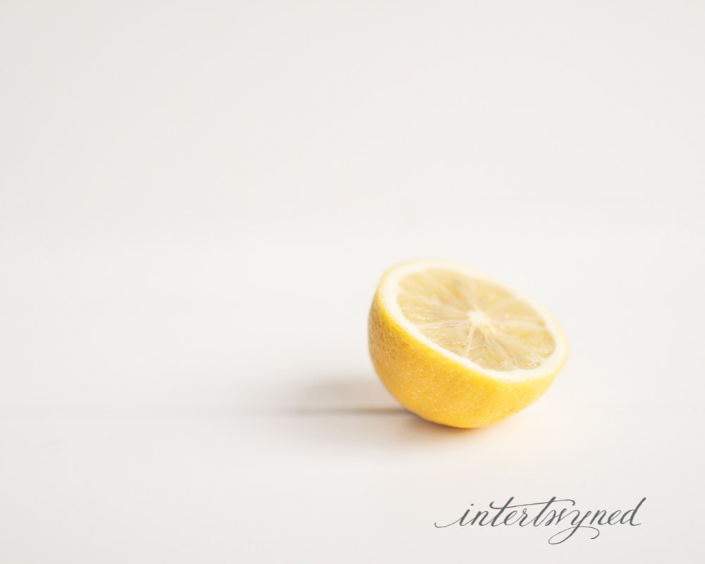
Giveaway from Intertwyned Photography!!

I loved taking that Souvenir Foto School course that did in February, I learned so much from the instructors, and also from fellow students.  Jamie is one of those fellow students that blew me away from her very first photo.  I will admit I spent a lot of time in Photoshop trying to emulate her gorgeous, soft, creamy shots.  I learned a lot about Photoshop in the process, but could never come close to the end results that Jamie got.  I was thrilled when she opened an etsy shop, and now am honoured that is offering one of her photographs to one of my readers!
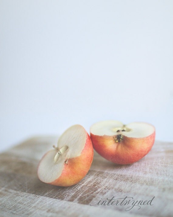
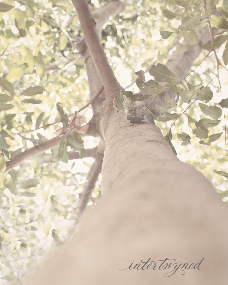
I would love this tree one blown up - I could stare into those leaves all day.  I should probably just get this to replace that old tree our back!

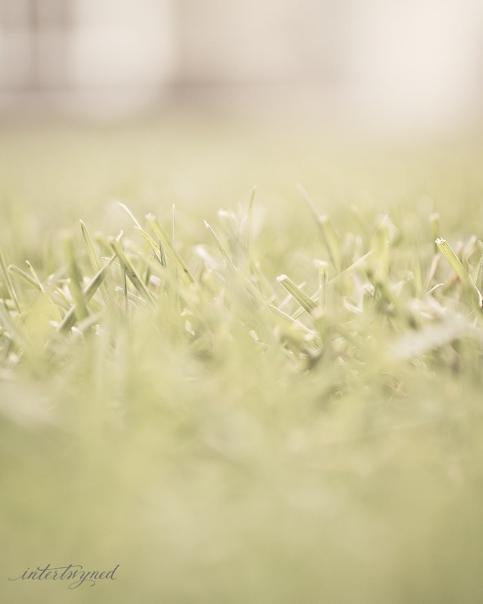
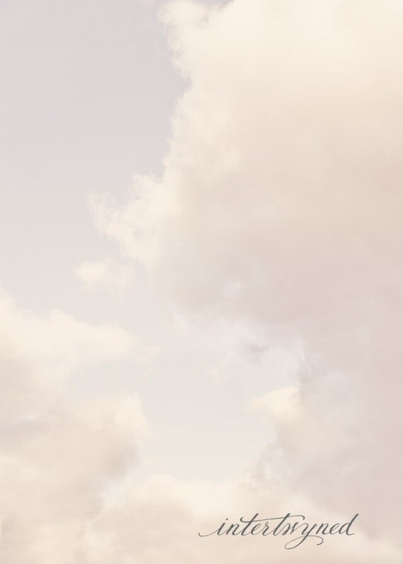
To enter the giveaway, please visit Jamie's Etsy shop HERE, then come back and leave a comment with the photo you would choose if you won.  Yup, winner gets to choose the print, up to 8 x 10 in size!
For extra entries, you have lots of options, just leave a comment for each one you complete:

  • Follow my blog over there on the right!  I love seeing new faces over there. :)
  • Follow Jamie's sweet blog - her friend's baby bump photos on there now are the cutest I have seen.
  • Like Jamie on Facebook (https://www.facebook.com/intertwynedphotography), and for another entry,
  • Tweet about the giveaway for one more!
EDIT: I forgot to mention the deadline! You can enter up to Sunday evening at 8 pm. I will announce the winner on Monday (and I may even have more goodies to give away!).
Her stuff is so dreamy... Wouldn't that cloudy sky be lovely in a nursery?  And I love the of having all the food shots be lovely grouped together in a kitchen.  They just make me think of fresh summer air and wispy curtains.  What do you think?

Thanks again Jamie!

Photo School V to Z

V is for Valentine
V is for Valentine
I have to admit, I definitely lost steam towards the end of the Foto School.  For some reason I just couldn't seem to find the same time to think up the shot, prep it, and edit it as I did at the beginning.  But I soldiered on and didn't miss a letter, although some of them are less than perfect (i.e. I wish I could have worked on them a bit longer!).  Here are the last of them, and I am throwing in a couple of extras I worked on but didn't submit.  I am also going to do another post and feature some of my favourites from the other class members (they were sooo good).
w is for wedding ring
W is for Wedding Ring
w is for white wine
W is for White Wine
x is for x-amining the menu
X is for X-amining the Menu (yes, I know it isn't REALLY...)
y is for y
Y is for Y-Stick (we have a collection...)
z is for zzzzz
Z is for Zzzzzzzzzs
If you missed them, here are the links to my posts with the rest of the letters of the alphabet:
All in all it was a lot of fun and I can't believe how much I learned about my camera and about photo processing.  Thanks to Tristan and Michelle for all their hard work in coordinating it, and to all the other fun photographers in the group who kept me so inspired - I can't wait for the next one!

Photo School O to U

O is for Orchid
O is for Orchid
Wow, this photo-a-day thing is intense.  I spend forever setting up, forever taking photos and adjusting settings, and forever in photoshop making it just right.  I think my husband is going to be very happy when it is over.  That being said, I cannot believe how much I have learned this time around.  Practice makes perfect, and while I am far from perfect, I am certainly getting in lots of practice - on my camera and in photoshop - which is invaluable.  I realize my photos have no distinctive theme or look, but that is because I am experimenting so much with each one.  I have my favourites - when I get to the end I would love to know if you do too!  Here is my latest instalment:
p is for paperbacks
P is for Paperbacks
Q is for Q
Q is for Q
r is for running shoes
R is for Running
s is for sand dollar
S is for Sand Dollars
t is for tulips 2
T is for Tulip
u is for upstairs
U is for Upstairs

Photo School J to N

j is for Japanese tea set
J is for Japanese Tea Set

Wow, this Souvenir Foto School* course is going quickly, and there are days it is all I can do to get a photo in in time.  I am actually not as happy with these as I was with the last batches - they were all rushed and don't feel like they are as good as I would have liked to make them, but that's life I guess - sometimes great, sometimes crap!  Fear not, I won't bore you with a litany of all the flaws I see in each one.  I do like the one of the boys, their expressions are perfect, and I want to munch on those chubby little legs**.  The 'M is for Music' one of course is me (I was holding the camera in the other hand to take the shot - rest assured it took more than one try to even get myself in the frame) so I don't like it.  Yes, I know I am too old to be so neurotic, but the truth is I am always shocked to see that what I look like is so different from what I think I look like!  I am sure if it was someone else's face in the same photo it wouldn't be so bad.  As a reminder, my theme is A Few Of My Favourite Things***.

k is for kids
K is for Kiddos

L is for Lemon Tree
L is for Lemon Tree

M is for Music
M is for Music


N is for New Brunswick
*This awesome course is taught by Tristan of Besotted Brand Blog and I LOVE IT and her.

**What on earth is the connection of women wanting to EAT adorable children?  Rather twisted really...

***Do you have that song in your head now?  No?  How about now?  I do.

Photo School - E to I

E is for elephant
E is for Elephant
Here is the latest instalment of my photo course* - E to I.  I have been spending more time thinking first about how I want my finished photograph to look, then setting up the shot, then editing.  I am happy to be able to put to use much of what I learned in my Photoshop Course at Toronto Image Works.

For E, I had a lot of elephants in our house to choose from - we must have at least 30 carvings, statues, photos, pillows, you name it.  I even did that painting for Cam's room.  But I had a vision of our soft little elephant that both boys snuggled with at some point, and I imagined a nostalgic, warm-and-fuzzy depiction of childhood/babyhood.  For F, I remembered the bright multi-coloured Mardi Gras boa I got on a night out with my friend Dan and decided on feather.  But the bright red was so unnatural, I pulled out all my photoshop stops and achieved more what I was aiming for - light, soft, etherial.
F is for Feather
F is for Feather
F is for Feather
The original image

For G, I started by shooting a vintage globe I have, which was fine, but I wanted to step outside the box a little bit, and ended up doing a self-portrait of sorts to capture my grandmother's gold necklace, something I remember her wearing all the time.  I am happy with this one - other than the sun damage it shows!
g is for gold necklace
G is for Grandmother's Gold Necklace

H was one I knew I wanted to do - since my theme is My Favourite Things, I took the stone shaped like a heart that Chris found years and years ago while we were out for a walk and set it against the setting sun.
h is for heart in hand
H is for Heart in Hand
While I was editing it, I could not get Jann Arden's song out of my head: Feet on ground / Heart in hand / Facing forwards / Be Yourself.  Aaaaand now it is back in there...

For I, I of course did my iPhone.  I once headed out of the house without it and just about had a panic attack/turned around to get it/pulled over and tore the car apart before I found it in my purse.  Yes, it's an un-healthy attachment.
i is for iphone2

So there you have it.  I am working on J tonight and am not feeling very inspired.  I was thinking jewellery, but I want to capture My Favourite Things, not alert potential thieves to Stuff Worth Stealing.  We shall see what I can come up with.  Let me know if you have any feedback or ideas for me!  There seem to be a LOT of letters left...

Photo School


A is for Apple
A is for Apple (brass apple)

I have been having a ball with my assignments for the Souvenir Foto School I signed up for.  They each take forever by the time I set up the shot, take a thousand, choose a couple to edit, fool around in Photoshop, and finally upload them.  My theme has been "A few of my favourite things" which is a pretty loose and easy theme, really.  Shannon of 8foot6 has been doing "stacked" as her theme and her shots are amazing.  We are going alphabetically again (although you don't have to do them in order) and here are my first four.  I would love to know what you think and if you have any constructive tips or feedback!

The original
B is for Buddha (antique statue from my father-in-law)
C is for Cole Haan
C is for Cole Haan (my most favourite boots in the world)
d is for diary
D is for Diary (my travel diary from my time in Southern Africa in 2000)

Julian Bialowas 365q

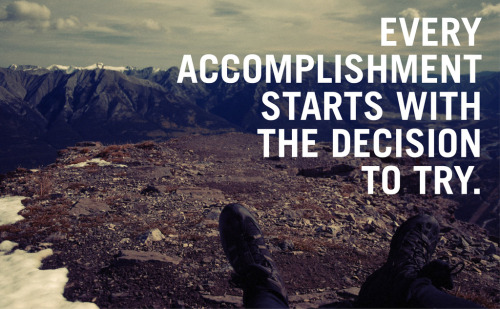
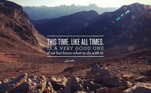
I re-pinned this on Pinterest the other day and the words have snagged in my mind like a burr.  I thought of it the other night when I ran 8K and remembered when I could barely run for 3 minutes at a stretch.  I thought of it as I went to my photoshop course and wondered what my next career steps were going to be.   I thought of it as I watched Will run up the steps - not awkwardly, not with the railing, not carefully placing two feet on each step, but just running.

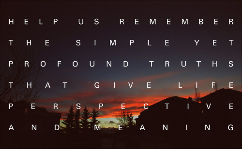
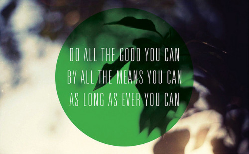
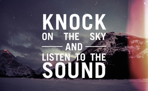
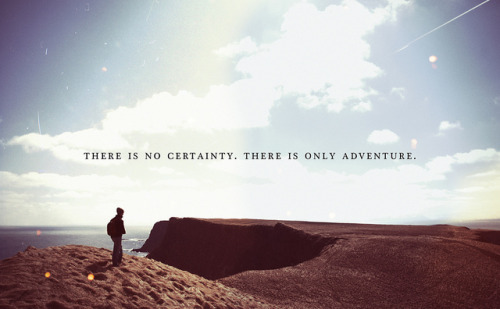
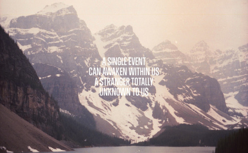
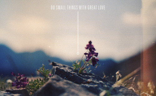
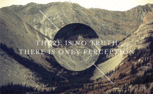
I have since discovered that this image was created by the talented Julian Bialowas of Calgary.  A self-taught photographer and graphic designer, he started his own 365 photography project.  The difference from most other such endeavours is that he doesn't take a daily photo, but instead combines one of his own images with some powerful words to create an inspiring artwork every day.  I love that the images are mainly of the Rockies - they seem to give the words more weight.  As I look through them, I can't tell if I am drawn to the words, the image, or the combination of the two.  You can find them all on his tumblr page, or his flickr, but here are a few that I loved:

You can now purchase any of his amazing pieces for a whopping $3 (a digital image will be emailed to you to do with as you wish) here.  They sure make me want to get out to the mountains, I can only imagine what they will do to my poor (Alberta-bred/mountain-obsessed) husband...


Via Dismount Creative.