Showing posts with label kitchen. Show all posts

Return of the Blogger


Hi all!  I hope you had a wonderful summer - not that it is completely over.  I had an amazing time in New Brunswick as usual and took a break from everything - including blogging.  But I am back re-energized and pumped and ready to get started on this place.

And oh, the projects we'll do!

To be honest, it is a little overwhelming.  Every room I am in, I look around thinking about how much there is to do.  Everything is unpacked and furniture is mostly set, but now I have to make the big decisions, ugh.  I don't really want to paint anything because they did such an incredible job, but some of the colours are just not me.

And I can't decide where to put which art.

And I want new art.

And new furniture.

And new rugs, lights, linens, shelves - you name it.

And my husband thinks everything is perfect just the way it is. Sigh.

The one decision I finally made was on the counter stools for the kitchen.  At first, we weren't going to get stools, and got some low bookcases to put under the overhang.  But they just didn't work for me, so I brought them up to the playroom (where they fit perfectly - hooray!) and started on the long road of deliberations.  Money being a definite hindrance (getting the stool of my dreams would have an easy decision!) I brought home several options before deciding on these bad boys from Bouclair.

 Holy awful colour - usually my iPhone is great but these are terrible... oh well.

These were the previous contenders (more bad pics):

Cheapies from Target - I think they were $20.  You could tell.
They would work maybe for a kids' playroom, but they didn't match the calibre of the kitchen.

Another contender from Bouclair - who knew they had so many stools?
These were just ok, and they had a bigger footprint.  And they were too white.

Anyway, big thanks to my Instagram friends for helping me out with that decision!

The glass cabinet kind of crowds them on the side... I would like to put some walnut floating shelves there instead... I think... there is really nowhere for display in this place.


All that being said, I love, love, love this house.  I think all these projects are more difficult for me to act on cause I don't want to mess it up!  The paint is perfect, I don't want to ruin it, but I don't love the colour.  There is nowhere to display my pottery and tchotchkes, but I don't want to work against the minimalism of the house.  I know that we bought it, I have to live here, etc. but it feels like a complete self-contained work of art, and anything I do to it will be something that future owners will be wailing about as they try to restore the aesthetic of the house, like people who live in Craftsman houses, or something.

Gosh, I really depend too much on external approval, don't I?  Why am I worrying about future owners of the house?  Or design snobs who will shudder at my every post?  Where do I get these wacky ideas??  Sometimes you just need to write something down to see how stupid it is.  And then post it for the everyone to read. :)

Building a design portfolio


As I launch into this interior design business, I realize that if I am going to go beyond friends and family, I am going to need to put together a professional-looking portfolio.  I am finding that this is hard to do in retrospect because the perfect "Before" shots may not exist, and I am not sure that my photography skill level is up to the best looking "After" shots (understatement).

I thought I would start by putting something together about my own kitchen first, since I have oodles of photos. None are styled the way I would like, but beggars and can't be choosers, and I am way too lazy to do that now. There is nothing like looking at your space on a photograph to really force you to take a step back.  For example, in the first photo my Breville espresso machine would be way better than that fugly toaster oven.  The chair and table are distracting in the corner.  The thermostat on the window sill needs to go and the whole counter, window - everything could be styled better.  I do like the splash of red/orange though.  Otherwise the kitchen is pretty bland in a photo.


It is also difficult to match up the angles of the before and after shots, but hopefully you can tell it is the same space.  It looks so wildly different to me, it's not even like looking at the same house!


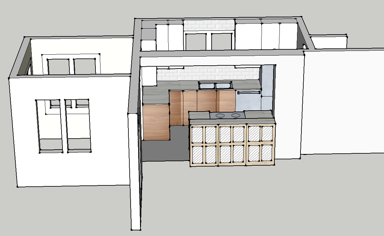
And then there's the drawings.  Do I add the drawings?  Are they part of the portfolio?  Do I add the final one or all the layouts I played with to get here?  I tell you, I pretty much did a masters degree in this SketchUp program by the time I was done this...


And I didn't do an inspiration board for myself, but I guess I should put one together in the style I would present to a client...

Anyway, thanks for reading.  I am excited to be moving forward on this. I have to say, Sarah Richardson's post on Facebook this morning was exactly what I needed to hear, and really got my butt in gear.  I even have found a photographer to do some of my other projects, hopefully they will end up way more profesh!  And the more I realize I have already done, the more I realize that the only thing holding me back is a lack of confidence, not a lack of ability.  And that just seems silly, now, doesn't it?


Hiding the Kitchen Clutter


I am quite thrilled with my kitchen; it was renovated over two years ago and I wouldn't change a THING about it - I love love love using it.  The only thing that was missing from it was a message centre or place to keep notices, tickets, adorable kid drawing, etc.  Our stainless refrigerator doesn't take magnets, which is fine with me - believe it or not I am a fan of clean lines and lots of space.  However, the piles of paper were growing and driving me nuts, so I picked the lesser of evils and hung this metal board from Ikea on the front of Dad's cabinet. While it did corale the bits and pieces, I didn't like that it marred and obstructed the beautiful cabinet, that it bonked the door every time you opened or closed the cabinets, and that it never looked tidy.

Wow this looks refreshing...

It has been SO HOT and muggy this week, and I have spent more than one sleepless night trying to figure out how to install air-conditioning in our hot-water-heated house (um...for free).  I was sitting here, sweating and complaining as per norm, when I opened the new Covet Garden and amongst the gorgeous photos of a very funky home I saw this recipe and thought of the ginormous watermelon in our fridge and the ginormous bunches of basil in our garden.  I tell you, if I weren't so damn hot I would get up and make this lovely concoction...

Unstyled: I love my kitchen

Inspired by Jules's "Unstyled Life" posts, I thought I would post my typical afternoon, getting supper ready in the kitchen while my kids play in the sunroom, the afternoon sun pouring in.*  The fan whirrs, the cicadas buzz, and the kids murmur their toy's stories.  Makes a girl's heart happy.
*Makes me think of that line from one of my all-time favourite Joni Mitchell songs: ...the sun poured in like butterscotch and stuck to all my senses...

My Dream House/Cottage

Sometimes I run across a house or a room in my blog travels that gets me so excited and I can't wait to put the photos on my blog.  I have tried to figure out what elements cause this reaction, and have identified a few themes that I seem to respond to: wood (furniture, floors, shelves or sculptures), white (furniture, walls, or floors), simple, clean lines (nothing too fussy or ornate), a mix of modern and antique, lots of natural light, and handmade objects or original art.

Take this photo above from the cottage of Amie Weitzman I saw on Design*Sponge.  I love the white walls, the simple but elegant wood bench, the big windows, the iron of the modern lamp and the antique window pulls, and the beautiful art - especially the portrait on the wall.  The rest of the house is as beautiful and combines these same elements in many ways.  You can see the whole tour here, but I will post the photos that originally quickened my pulse - the kitchen!
This last photo is my ultimate fave.  Clean white counter, modern pulls, and those SHELVES.  How amazing they look with those wooden bowls on top...  What do you think?  What elements set your heart a flutter in a room?

Photos by John Gruen, styling by James Leland Day (notice the salt and pepper shakers and Jonathan Adler vase moving around in the full tour!)

Wallpaper Happily-Ever-After

I am not sure I would ever use wallpaper.  I love it, and am drawn to it, but I am too much of a commitment-phobe. All that work, all that pattern - what if you change your mind?  However, photos like this make me want to grow up and settle down with a nice, happy wallpaper.  Smile at it over the morning paper and congratulate myself on having made such a good choice; gaze at it by candlelight and fall in love all over again.  With the white floors, natural light, and red cabinet - could you really ever be sad in this room?  I didn't think so.
Although... hmmm, pretty sure my husband won't like that one.  That's the problem - even when you finally find the right wallpaper and are ready to commit, you realize that the other half has to agree, which almost never happens.  (Very much like finding baby names BTW...)   

The rest of the home is beautiful as well - check it out on La Maison d'Anna G.  Photos by Stadshem.

To dry for

I saw this photo on Lori's blog, and immediately felt an affinitely for the artwork, which turns out is a tea towel.  I went in search of this fabulous towel, and found many many more at To Dry For:

 I love the Mr. Tea Towel.... heh heh...  and the gin and tonic one is awesome.

The kitchen is really done. Mostly.

Remember my mostly-finished kitchen with the plywood back? The plywood that may or may not have fallen on the children?  Don't worry, no one was harmed...just a little startled.  Turns out you get what you pay for with dollar store duct tape.  Anyhoo... we got the cabinet in over the holidays!  I just love it, it gives some extra storage and completely finishes the kitchen off.  I was worried that it would take up too much space in the dining room, but it actually works quite nicely.  YAY!  We also got around to putting up some art work which also helps make the place feel a little more cozy!
Please don't mind the mess - my 'photo styling' consisted of moving anything that might trip me while I snapped some photos... So the last step (besides getting the plug put in...heaven forbid we be completely done) is the handles!  I was thinking of plain white ones, but then thought maybe some little crystal ones would be nice, since all the doors on the main floor still have their original crystal handles.  Then there are those mother-of-pearl pulls from Anthropologie that I have been drooling over for years... not sure if I can do brass though, since the rest of the kitchen is so stainless.  I do have that brass light in the sun room though, and it IS a separate room...  What do you think?  Below are my options from Anthropologie, Lee Valley and Ikea (with prices to match!).
I am so excited to have it finished!  Now I just have to find the time to wash it out, along with Dad's cabinet, and unpack those kitchen knick knack boxes we packed up last YEAR!!