Showing posts with label interiors. Show all posts
Mucho Modern in Calgary
We did it folks, we bought a new house!! I don't think I have ever spent so much money so quickly in my life. Strike that - I am absolutely 100% certain that I have never spent so much money in my life in such a short amount of time. If I think too much about it, it makes me a little bit ill... so we'll move on.
Here's the scoop: Last weekend, my husband and I flew out to Calgary after work on Friday, and after dropping our kids off at our AMAZINGLY generous friends' house for 2 nights. Saturday morning we were up bright and early to explore Calgary with our agent. At this point our Toronto house was already on sale.
Now if you had asked me about Calgary a few months ago, I would not have been able to tell you anything, other than my opinion that it needed some more trees (lots more trees). After finding out that we were moving there, I spent hours, and hours, and hours online. I think I could identify just about any neighbourhood in the city in under 5 seconds at this point, and also tell you the name of the closest French Immersion school, how many minutes it would take you to ride a bike downtown, and how far the closest Starbucks is. I had that whole every-street-is-a-number and streets-go-one-way-and-avenues-go-another-way-and-don't-forget-about-the-quadrants thing DOWN. I have my mls/Google Maps/CalgarySchoolFinder black belt, and I know how to use it.
Up until last weekend though, I had never physically been in 99% of the places we were looking. Luckily, Calgary is wonderfully small! I mean that in the best way possible - we wanted to be "downtown" and were stressing about one area versus another, but really, they are all pretty close, and it is very easy to get around town.
Our agent and I had determined a short list of houses we wanted to see - I think 12? (... not sure who I am asking...) When we walked in this one, our jaws hit the floor. HIT. THE. FLOOR. We loved it! But... it was a bit further from downtown, and more than we were going to spend... yada yada yada. We said we would think about it. The next day we saw a few new ones that were great contenders, and then went back to look at this one again. I got tingles. That evening, we sat at the pub down the street and enjoyed local craft beer while signing our offer document. It took our agent all of a minute to print them off - he had already filled in all the information for this house the night before. He knew. I guess I am an open book.
We put in a low offer hoping that we could bring the price down a bit (yes, you can do this in Calgary!). When the sellers didn't budge much, we/I got cold feet and decided to drop it. Yup, just like that. It was just too nice for us.
Instead we focussed our attention on the "perfect-on-paper" runner up. The neighbourhood for house #2 was amazing - Chris could walk to work. We would be near friends of ours, and the school was great. The house was overpriced, according to our guy, and we could get it for much less than the first place. It was ugly - DAMN ugly - but heck, there would be lots to blog about! The before and after pictures would be killer. It was the responsible thing to do. However... when they got our offer, I guess the sellers had decided they weren't so keen to sell after all. They didn't budge on price, and they extended the possession date to the middle of the summer. This would not work.
I don't think I had even processed this bit of information before Chris was back on the phone to our agent telling him we wanted the first house! A day or so later, my finger nails were gone, and we were the new owners. Apparently there are Real Estate Fairy Godmothers, and I have one. (Thank you thank you REFG!)
Before I show you all the pics, let me begin by saying that I am pretty sure we are not worthy of this house. I can imagine walking in with our stuff, only to have the house twist itself up and spit me and my Value Village/Ikea As-Is finds back out onto the street. It is so beautiful. I don't know what the heck I am going to blog about, because I don't even think I will paint the damn walls.
It is a semi-detached, or duplex. I never thought I would spend so much to live in half of a house, but this is 80% of what is available in Calgary - brand new enormous duplexes. Our half is on the right.
Please note that this house has been staged for these photos impeccably. It was empty when we looked at it, but now I can't imagine it with any furniture other than this stuff.
The kitchen makes me want to be a better person. Or at least a better cook. Notice how it is similar to ours with the wood on the bottom and white lacquer on top? And there the similarities end...
There is so much storage in this freakin kitchen I think I am going to have to keep some of my clothes there.
So... yeah. I know. It's obscene. It's ridiculous. I don't even.... words fail me. By some amazing twist in the fabric of reality, I will (soon!) be living in this house. Surrounded by all those BIG TREES. (I'll take my words with a side of mayo, thank you...) Twenty minutes from downtown by bike, ten by car. With a yoga studio down the street. Basking like a cat in all that LIGHT. I am beside myself!
Anyone wanna come visit?
Labels:
Alberta,
Big Move 2014,
home,
interiors
Building a design portfolio
As I launch into this interior design business, I realize that if I am going to go beyond friends and family, I am going to need to put together a professional-looking portfolio. I am finding that this is hard to do in retrospect because the perfect "Before" shots may not exist, and I am not sure that my photography skill level is up to the best looking "After" shots (understatement).
I thought I would start by putting something together about my own kitchen first, since I have oodles of photos. None are styled the way I would like, but beggars and can't be choosers, and I am way too lazy to do that now. There is nothing like looking at your space on a photograph to really force you to take a step back. For example, in the first photo my Breville espresso machine would be way better than that fugly toaster oven. The chair and table are distracting in the corner. The thermostat on the window sill needs to go and the whole counter, window - everything could be styled better. I do like the splash of red/orange though. Otherwise the kitchen is pretty bland in a photo.
It is also difficult to match up the angles of the before and after shots, but hopefully you can tell it is the same space. It looks so wildly different to me, it's not even like looking at the same house!
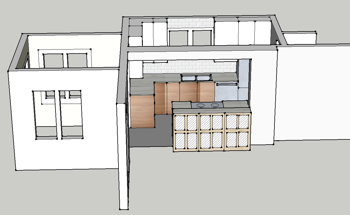
And then there's the drawings. Do I add the drawings? Are they part of the portfolio? Do I add the final one or all the layouts I played with to get here? I tell you, I pretty much did a masters degree in this SketchUp program by the time I was done this...
And I didn't do an inspiration board for myself, but I guess I should put one together in the style I would present to a client...
Anyway, thanks for reading. I am excited to be moving forward on this. I have to say, Sarah Richardson's post on Facebook this morning was exactly what I needed to hear, and really got my butt in gear. I even have found a photographer to do some of my other projects, hopefully they will end up way more profesh! And the more I realize I have already done, the more I realize that the only thing holding me back is a lack of confidence, not a lack of ability. And that just seems silly, now, doesn't it?
Labels:
camera,
decor,
interiors,
kitchen,
photography
Inspired by Elle Decor's December edition
![]() |
| Original photography by William Abramovitch |
Have you ever found a new shelter magazine in the mail, drooled all over the cover, made yourself wait to open it until you were comfortably nestled with a cozy throw and a glass of wine, and then flip, flip, flipped to the end without being stopped by anything inside? That did NOT happen today when I got the December Elle Decor in the mail. I was so excited I actually put down the wine and took photos of the photos in the magazine. I know. There were a few homes and designs that, while I appreciated the aesthetic, did not appeal to me. But the St. Bart's beach house of Parisian interior and furniture designer Christian Liaigre pictured above had me already feeling the humid breezes and hearing the sounds of the surf. Who knew a beach house could be sophisticated? I love the kitchen and the bathroom especially, and the outdoor eating area (which I didn't show - you have to look at the magazine for that one - trust me it is beautiful).
It could be that the editor Michael Boodro's letter hit the nail on the head for me - I have often wondered how I could be attracted and happy with so many different styles of design. Shouldn't I have one signature style? Michael says no. Boo-yah Michael.
For example, I would have no where to put this amazing light fixture - it does not jibe at all with the things I have in my home - but I covet it none-the-less. How does this make sense? Sooo shiny...
My photo does not do justice to the rich, yummy, deep velvety green on this sofa in the ad for Ochre. It is actually much darker. I tried to find it online but no dice. It's that amazing mossy forest green that you feel like you could fall into and dream of fairies and sprites in magical German woods. Or something... But when I saw it I knew immediately that THIS is going to be my colour this Christmas - this rich deep velvet green, with cream and gold and white and lots of sparkly little lights. Think Value Village has any deep green velvet...? Perhaps velour will do in a pinch, provided I maintain low lighting at all times.
![]() |
| Original photography by Eric Piasecki |
Much of this "cabin" (monstrous home) in Colorado designed by Caroline Sarkozy was a little contrived for my taste - too much birch bark, antlers, and pine cladding for my liking. But for some reason I enjoyed this cozy home office pictured above - a photo tucked away on the contents pages ...maybe I would just add some books to those shelves.
![]() |
| Original photography by Jean-François Jaussaud |
Another little snapshot from the contents pages was this beautiful curved nook found in a chateau in Provence owned by the designer Pierre Yovanovitch. The rest of the chateau was very nice in an overt modern-minimalist-luxury-in-an-historic-French-chateau kind of way, but everything about this image appeals to me much more. The curved wooden shelves on the curved wall, the rustic dishes, the wooden-framed painting, the two-toned wall, the delicate antique rocking chair - c'est parfait.
![]() |
| Original photography by William Waldron |
However, the home I could move into in a heartbeat and change NOTHING is this fishing cabin-turned weekend house designed by Amy Mellen, creative director for Calvin Klein Home. Just look at the mix in this kitchen. Sleek cabinets, faucet, stainless appliances, and Calvin Klein windsor chairs - with their modern angles and lines - pair so perfectly with the antique table, original pine floors and dark-trimmed sash windows. And such great styling by JC Garcia Lavin!
And that bedroom is just so serene and right up my alley. In fact, I think that might be the colour of my bedroom walls. If only I didn't kill those weird ferns every time I buy one. Again the mix and styling in this photo (or at least the actual photo in the magazine) are great. (Wait, wasn't that fern on the mantel before? Maybe they aren't meant to live - maybe they're just for styling!)
So thanks for letting me read the magazine for you, and thanks to Elle Decor for actually inspiring a blog post. That's no small miracle these days!
Labels:
decor,
inspiration,
interiors,
magazine
Competitive Home Decor
| Click to see source on Pinterest |
It finally is starting to feel like fall around here, which is great. Not great because I love fall, (November is the most miserable month of the year, in my opinion), but because with the lovely warm September and October, I found myself outside watching the kids in the playground, going for bike rides and walks, and generally soaking up every last morsel of sun and warmth like someone scarfs down caramel cheesecake knowing she is starting a diet the next day.
| Click to see source on Pinterest |
... funny, the hubster is on the other side of town, but I could swear I just heard him groaning...?
Anyway, hopefully this new-found competition/inspiration will result is some fun blogging. In the meantime I leave you with some of my more recent Pinterest pins, because a blog post with no images is a sad blog post indeed, and I ain't showing you my house beside their house.
| Click to see source on Pinterest |
| Click to see source on Pinterest |
| Click to see source on Pinterest |
| Click to see source on Pinterest |
Labels:
fall,
home,
inspiration,
interiors,
pinterest
Is champagne gold the new brass?
I love my iPhone - probably too much (especially according to some people who shall remain nameless). I have the ancient iPhone 4, and considering I use it almost constantly every single day, it has held up pretty well. But the home button is going, the memory is full, and my contract with Bell is up. Lucky for me, it is just in time for the launch of the new iPhone 5c and 5s! I haven't decided which one I am going to get (any advice?), but I can't help but admire the new champagne gold colour Apple has introduced.
Brass has been everywhere the last couple of years, and although I admit it took me a bit to get over my 80's brass associations, I have embraced it wholeheartedly. I love a warm, patinaed brass - it gives a sense of history, a connection to things past. Lately, the trend seems to be turning to more of a shiny gold, and I keep seeing rose gold accessories everywhere.
I think the champagne gold chosen by Apple is going to be popular, because it is almost the perfect halfway point between gold and silver. It has the sleek sheen of stainless, the warmth of gold and brass, and the novelty of copper. In googling 'champagne gold', it seems that the wedding industry still has an almost complete monopoly of the colour (shudder), but I managed to find a few items that would be perfect pieces to add that subtle shine of this very neutral metal to any room.
1. Silver leafed boxes from Studio A
2. Faceted paperweight from Living by Christiane Lemieux
3. Gorgeous metallic foil cushions from Caitlin Wilson
4. Morrocan-inspired side table from Zinc Door
5. Hollywood Regency drum table from Kathy Kuo Home
6. Mercury glass table lamp from Kathy Kuo Home
7. Serving bowl from Pier 1
8. Champagne chevron rug from Ralph Lauren Home
Of course I had to do a style board as well, cause... why not?
1. Champagne long puffa coat from Dorothy Perkins
2. Bookclub glasses in Champagne from Madewell
3. Parker Blue eternity scarf from Barneys New York
4. Champagne gold metallic leather wallet from Gift Shop Brooklyn
5. Vegan sequined smoking slipper from Arisa
6. Classic Metro watch from Kate Spade
2. Bookclub glasses in Champagne from Madewell
3. Parker Blue eternity scarf from Barneys New York
4. Champagne gold metallic leather wallet from Gift Shop Brooklyn
5. Vegan sequined smoking slipper from Arisa
6. Classic Metro watch from Kate Spade
I still love me my brass, but there is something very fresh and clean about this shade of gold. I think it could be great as a statement colour, like in the kitchen, or just as an added bit of sparkle in the accessories. Here are a few inspiration rooms that incorporate this colour:
![]() |
| Jean-Louis Deiot's kitchen as featured in Elle Decor. Photo by Simon Upton. |
![]() |
| Suzanne Kastler's Atlanta Home featured in Architectural Digest April 2012 |
![]() |
| Vancouver kitchen designed by Natalie Culter featured on Marion House Blog. Photography by Janis Nicolay. |
![]() |
| Staircase by Based Upon. |
![]() |
| Bestlight wall sconce as featured by Studio Number 19 Blog |
Contemporary Dining Room by New York Interior Designers & Decorators MuseInteriors
![]() |
| Bathroom design by Greg Stewart as featured in Interiors Magazine. |
I think I like it as long as it steers clear of the pinker version... so basically, I like light brass or gold. As soon as it heads silver or pink, it gets a little 'ruffles, bedskirts, and tiaras' - which is fine, but just isn't for me. What do you think? Will we be seeing more of Champagne Gold?
And what iPhone should I get??
Subscribe to:
Posts (Atom)