Showing posts with label colour. Show all posts

Is champagne gold the new brass?

champagne_gold_iPhone_5s_trend_new_brass

I love my iPhone - probably too much (especially according to some people who shall remain nameless).  I have the ancient iPhone 4, and considering I use it almost constantly every single day, it has held up pretty well.  But the home button is going, the memory is full, and my contract with Bell is up.  Lucky for me, it is just in time for the launch of the new iPhone 5c and 5s!  I haven't decided which one I am going to get (any advice?), but I can't help but admire the new champagne gold colour Apple has introduced.

Brass has been everywhere the last couple of years, and although I admit it took me a bit to get over my 80's brass associations, I have embraced it wholeheartedly. I love a warm, patinaed brass - it gives a sense of history, a connection to things past.  Lately, the trend seems to be turning to more of a shiny gold, and I keep seeing rose gold accessories everywhere.

I think the champagne gold chosen by Apple is going to be popular, because it is almost the perfect halfway point between gold and silver.  It has the sleek sheen of stainless, the warmth of gold and brass, and the novelty of copper.  In googling 'champagne gold', it seems that the wedding industry still has an almost complete monopoly of the colour (shudder), but I managed to find a few items that would be perfect pieces to add that subtle shine of this very neutral metal to any room.

1. Silver leafed boxes from Studio A  
2. Faceted paperweight from Living by Christiane Lemieux  
3. Gorgeous metallic foil cushions from Caitlin Wilson  
4. Morrocan-inspired side table from Zinc Door 
 5. Hollywood Regency drum table from Kathy Kuo Home  
6.  Mercury glass table lamp from Kathy Kuo Home  
7.  Serving bowl from Pier 1  
8.  Champagne chevron rug from Ralph Lauren Home

Of course I had to do a style board as well, cause... why not?

1. Champagne long puffa coat from Dorothy Perkins 
2. Bookclub glasses in Champagne from Madewell  
3. Parker Blue eternity scarf from Barneys New York
4. Champagne gold metallic leather wallet from Gift Shop Brooklyn 
5. Vegan sequined smoking slipper from Arisa 
6. Classic Metro watch from Kate Spade

I still love me my brass, but there is something very fresh and clean about this shade of gold.  I think it could be great as a statement colour, like in the kitchen, or just as an added bit of sparkle in the accessories.  Here are a few inspiration rooms that incorporate this colour:

Elle_Decor_jean-louis-deniot-paris-apartment-design _Champagne_silver_gold
Jean-Louis Deiot's kitchen as featured in Elle Decor.  Photo by Simon Upton.
Suzanne Kastler's Atlanta Home featured in Architectural Digest April 2012
Vancouver kitchen designed by Natalie Culter featured on Marion House Blog.  Photography by Janis Nicolay.
Staircase by Based Upon.

Bestlight wall sconce as featured by Studio Number 19 Blog

Bathroom design by Greg Stewart as featured in Interiors Magazine.

I think I like it as long as it steers clear of the pinker version... so basically, I like light brass or gold.  As soon as it heads silver or pink, it gets a little 'ruffles, bedskirts, and tiaras' - which is fine, but just isn't for me.  What do you think?  Will we be seeing more of Champagne Gold?

And what iPhone should I get??

Bright Bobbie Burgers Colour


It has been a while since I have done a proper blog post.  You know how you miss a day or two at the gym or skip a few runs, and it isn't so hard to get back on track?  But when you miss a week, suddenly you feel guilty for not going, but don't go.  Then it's another week and you aren't sure how to ease back into it without hurting your knees, so you don't go. Then people start to say things like "remember when you used to run?"  Yeah that's how blog posting has gone for me lately (and the running thing may or may not be personal experience...).  But here I am, ready to get back at it.  Perhaps it was this gorgeous room in the weekend's Globe and Mail of Bobbie Burgers's living room that did it.  I love it SO much, especially that incredible painting.

My soul-soothing escape from reality

Hello all, as you may have gleaned from my last post, I have been stressing more than just a bit lately.  Not really actively stressing mind you, rather ruminating - my mind chewing over what if's and to-do lists and schedules and such - in a constantly increasing and incessant way.  The timing could not have been more perfect for a trip to the Caribbean to visit my parents.  They built a house there years and years and years ago, but for some reason I have not made a point of going down.  I was too busy, it was too expensive, I couldn't afford the vacation time, yada yada yada.  

This year, as always, my mom said please come down.  I said yeah... maybe...., as I always do.  My Prince Charming of a husband, however, said this is nuts, you insane woman, and made it happen.  He booked the flights, took vacation from work to look after the boys, arranged a babysitter for the days he had to work and pretty much threw me on a plane.  All the while I was thinking what am I going to do down there?  What if I drive my parents nuts (and vice versa)?  I brought my computer to catch up on the all the work and projects that I needed to be doing, all the blog posts I haven't written, and of course my ongoing debate as to what to do with the rest of my life.

I did none of it.  I can hear you all saying "duh...!" but for some reason I did not foresee how AMAZING this week was going to be.  I am not going to go on and on about it because, well, I know how sick everyone is of winter, and, um,  I don't want you to hate me.  The major points: *first time away without the kids for so long, *first vacation by myself (i.e. without hubby) in about 15 years (this was also part of my reluctance to go - I love traveling with him) *first time hanging out with my parents by myself in around 20 years *being spoiled by my folks *warm sunshine *bright colours *green green green *warm sunshine *didn't make lunch or dinner once *rum and ginger ale on the porch *yoga and swimming *wonderful parents *warm sunshine...  OK, done.  No wait, there's photos:


So there you have it.  I honestly feel like a different person.  It really shook things up for me, although I didn't realize how much until I got home.  After the requisite grumpy back-to-winter blues, I feel great, calmer, less stressed, more centred.  I cannot thank Chris and my parents enough.

All of the "taxis" (i.e. mini-vans crammed with people) down there have slogans running across the top of their windshield, and the one I that stuck with me was "Too Blessed To Be Stressed."  Amen Mr. Taxi Driver, AMEN.

Thank you also to all of you who commented on my last post, and emailed me encouragement.  It meant the world, it really did.  I have been reading and re-reading them ever since.  I think I am starting to figure some things out, which I will of course share with you - cause that's what I do.  Blogging is kind of a strange beast, part confessional, part public diary, part scrapbook, part PR machine... but the community that comes with it, the feeling of connecting to people, is so strong and heartfelt it sometimes surprises and delights me.  MOOAH.

Pretty little things make me happy


The lovely Brooke from Pure and Noble had a sale of some of her vintage items and I nabbed this cute little blue vase.  It reminds me of the Russel Wright dinnerware that I would love to collect.  It was sitting in my glass cupboard until I found a branch had broken off my new poinsettia plant during transport.  I couldn't bear to toss the pretty flower, and went to find a small vase - and voila!  I think it couldn't be more perfect.  Aren't the colours of the leaves gorgeous? They look painted on.

Sometimes the little things can make me so happy... :)

A confession...


OK, I am going to come right out and say it: I don't like fall.  Or even autumn.  Yes, I know, the colours are incredible, the air is crisp, yada yada yada.  The thing is, I really like summer.  The windows open, the sound of cicadas, the feel of grass under bare feet, simple loose clothes - this is my happy place.  The fall means the end of all that, and worse, the onset of winter (cue gloomy music). Everything is dying.  There is the smell of decay in the air.  And I really don't like the colour burgundy.  Or MUMS AND CABBAGE PLANTERS.

PHEW.  I feel better getting that off my chest - liberated even.

However, I have been told that this opinion is a 'downer' (perhaps it was the reference to death and decay...) and I have obligingly tried to find the magic in the season.  I even took pictures - see?  A lovely walk in the ravine, a trip to Downy's Farm with Cam's school, playing with baby snakes... all good autumnal times.  Let's call it my Instagram Ode to Autumn.
 (Cam seems determined to put up with it all as well in that last photo.  And the other one?  Must be his father's genes.)
I do love a visit with Baba, winter, spring, summer or fall.  And family photos of all four of us are so rare I am happy with that one too.  And, um,  yellow is really pretty... sort of like the sunshine on a warm summer's day... 

I really am doing my best here people.

The dresser project: let there be light!

I am happy to report that one item on my project list has been checked off.  The new school year filled me with energy and enthusiasm, and one day I found a drop cloth, took out the drawers on my big dark dresser/toy cabinet, and got busy.  No time like the present, right?  I sanded it all down with my rotary sander and by hand, and removed the hardware.  There was a LOT of hardware.  Each drawer actually had four separate pieces, and they were screwed and nailed down.  This thing was built to last!
I then primed it with STIX Bonding Primer, using a 2-inch angled brush and a "velvet nap" mini roller. I wasn't messing around.

My biggest hurdle was choosing the colour - I am not what they call "decisive."  I got so many great suggestions from you guys and on Twitter, and really dithered about this.  My poor Para colour deck got quite a workout.  Finally, I went with my gut and chose a creamy white - Desert Sand to be exact.  I dug out my coupon for a free gallon of Para Ultra paint that I got at Blog Podium (thank you Para and Blog Podium!) and headed to the local paint store in the Junction.  I have to say, I normally just whip up to Home Depot and choose the cheapest paint I can get.  Having this certificate forced me to find a Para paint distributor, which happily was West Toronto Paint.  I had the best service, loved supporting a local store, and don't think I will be going anywhere else for paint any time soon!  They gave me great advice on how to go about it: many thin coats ("as thin as you can get") with a light sanding in between.  This is quite a departure from my usual glob it on thick to avoid too many coats.  And sanding in between? Yeah, right. 
This new-found high standard approach made for a lovely smooth finish, and many many days of chaos.  Also, I became a little obsessive about it, constantly feeling for any drips, bumps, or nicks.  Did I mention this baby is seven feet long and has nine drawers??
So you can imagine my dismay when I put it all back together and the doors in the centre wouldn't close.  I took them off again and laboriously scrapped off all my meticulously-applied paint from behind the hinges, and on the doors.  I have managed to jam them together, but can't quite figure out why they won't close.  My mum suggested that maybe the moisture from the paint swelled the wood itself?  Argh.  Double Argh.

Whatever - moving on.  Maybe I will eventually plane them and repaint. (As if...)  I put the half the hardware back on, after polishing it all up.  The original drawer face configuration just seemed too heavy on the lighter background.  Plus, I didn't want to cover up all my hard work!  I also left the three middle drawers (behind the doors) as they were.  Call it strategic, call it laziness.  I like it.

The result pretty much rocks my world.  SO much brighter and lighter in there!  You may have noticed I also moved the dark brown sofa from there and switched it out with the little blue one.  I am thinking of adding another project to the list - recover the blue sofa!  I do like the smaller size and lower back as it also helps open the place up.  So there you have it.  Dresser = Done. You like?


PS. Can you spot Cam in the after photo?  :D
PPS. All the lovely arrows I had so much fun using in Photoshop were a free download from the ever-amazing Ez at Creature Comforts.

An Autumn Weekend

This weekend definitely felt like fall.  For the first time in ages I was actually cold when I went to sleep!  We were supposed to go camping but bailed when the boys were up all night with miserable colds and Saturday morning it was pouring buckets of rain.  Oh, and did I mention it would be the boys' first camping trip ever?  Probably better to stay home and work on my list of project, wouldn't you say?

I am almost finished painting the dresser - I have tried to do it well, not just quickly (which is my usual painting method-of-choice) and have been at it for 5 days.  I am on my sixth super thin coat, with sanding in between each layer and a day for each to dry.  I suppose five days isn't much in the grand scheme of things, but when the piece of furniture in question is used for housing thousands of toys, and said toys are now randomly piled and scatted all over the first floor, and the piece has nine drawers and two doors that are also strewn about the same area, and half of your living room furniture are under a painting drop cloth.... five days is a loooong time.  I am hoping that tomorrow I can put it all together again, put the toys away, take some photos, and restore a tiny piece of my sanity.

Then on to something else, which I have decided should definitely have beautiful fall colours like the ones in the bouquet above.  Isn't it incredible?  The gold service is not-too-shabby either...

Photo from Honey of a Thousand Flowers - one of the best floral eye candy sites out there.
Arrangement is by Sarah Winward, photography by Green Apple Photography

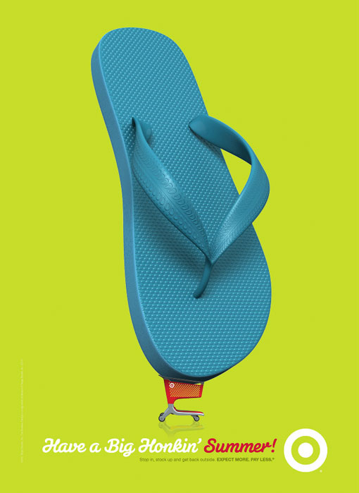
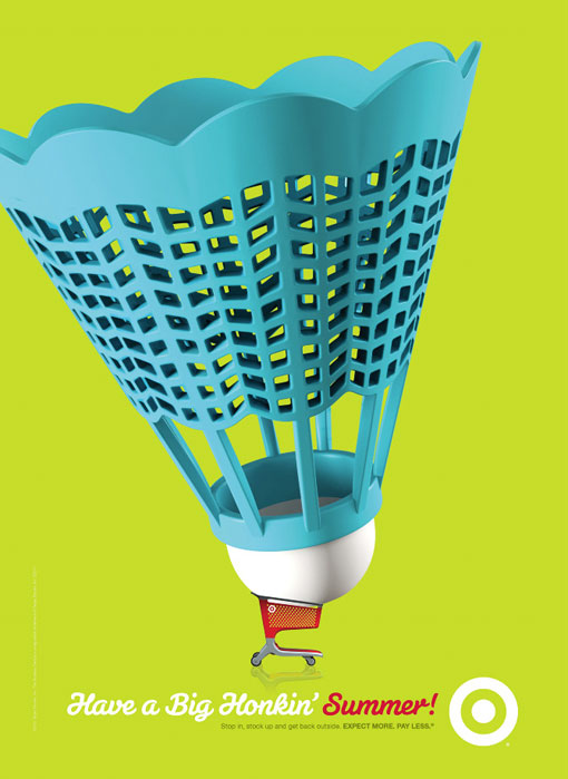
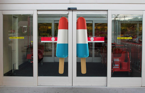
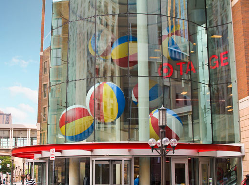
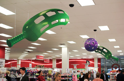
Target wants you to have a Big Honkin' Summer

I love these big, punchy, graphic, and colourful advertisements for Target.  They are so happy and cheerful, and noticeable while still being consistent with their usual branding.  Their agency also did a great job of recreating the spirit of the campaign in-store.

Their first stores are set to open in Canada in March/April of next year.  Are you excited?  Or is part of the charm of Tar-Jay that it is always linked to a cross-border adventure?  I know that I still love Crate & Barrel, but J. Crew is a bit of a disappointment for me.  I was watching a report on the National last night that was projecting what the arrival of big US companies like Target would mean for Canadian companies like Jacob and (American-owned) Sears and The Bay.  Do you ever consider nationality when you shop?  I know sometimes I will go to Canadian Tire before Home Depot when I am feeling nationalistic, but am usually lured by the price above all.


Agency: Target iH
Sr. CD: Jason Langer
CD: Jon Baugh
Sr. Art Director: Allan Peters
Jr. Art Director: Emily Reile
Writer: Anna Stassen
Illustrator: Tom DiTolla: Spectrum Studios
Found via Design Work Life

Bright Cheerful Palette in France

My Aunt Daphne emailed me these photos the other day and I felt it was my duty, nay, my obligation to pass them on to you.  How could I in good conscious hold on to these colourful gems and hoard their happiness for myself?  Never did I think I would lust for pink and lime green walls or purple and orange furniture, but there you go.  Perhaps it's heat stroke, who knows.  What about you?
I love the two different curtains in the bedrooms - saves one from having to make a decision on fabric! Not sure how the decor works around Christmas time, but I suspect that in the winter the owners have the home closed up and are reveling in their chalet in the Alps in winter-decor heaven...

Images from Haute Design and Nicety