Modern Craze

One blog that is going to make it on my next list of Great Canadian Design Blogs is Style North, penned by Christopher Jones.  He does the most wonderful house tours, somehow they are unlike any other I found online.  They have the same mid-century content as many others, but his feel so much more "real" - they're a peek into someone's well-appointed house, without all the styling or meticulous artistic photography (I mean that as a good thing).  His most recent was the home of Larysa Fenyn, and it was great.  I mean, does this collection of Canadian pottery not belong in my house? (not to mention that rich gorgeous armoire)?
Photo by Clare Summerville via Style North
Larysa clearly has an excellent eye for mid-century vintage pieces, and luckily for us, an online store called Modern Craze where she shares the treasures she has found.  Which is where I found the bowl pictured at the top - and to quote the linguistically-gifted Rachel Zoe: I DIE.
So beautiful.  Too bad Christmas isn't coming up and all.... HINT (and also DIRECT LINK).

Here are some other gems from her store:
If you are in the market for vintage 50's accessories or Canadian craft ceramics and pottery, Modern Craze would be an excellent place to start!

Check me out on Style at Home!


Wow, somehow I was included among 12 amazing design bloggers in an article on Style at Home's website about our favourite fall trends. The funniest thing for me after all this moving of furniture is to look at the photo of my house from a couple of years ago - it's so different.  Oh yeah, and OMG my name is on Styleathome.com.  Among some pretty amazing design bloggers!  Wowzers.

So go see!  And thanks Style at home!

Once more, with feeling


Like a dog with a bone... I can't let it rest.  This is what happens when it rains and I can't just go to the park all morning!  First thing this morning (meaning after at least 1.5 cups of coffee), I parked the kids in front of Thomas the Tank Engine and rolled up my sleeves.  First thing I did was move the white cabinet to where I thought I could use some height, which left room to try the couch on the other side.  he next thing I did was straighten the chairs so Shannon's head would stay put.  En route to putting the sideboard back to the window, I decided I kind of liked it on the side wall. It makes it feel like more of a four-sided room, although getting by is a bit tight.  We'll see about that one, It may go back to the window.  The space behind the sofa seemed kind of wasted (i have to get used to it I guess) so that is where I put the kids table and some of their toys.
The globes are obnoxious I know, I just wanted to get them all out of the way.  I will move one of two up to Will's room.
I think my 'winter' curtains will help give this area a little more definition... I am going to try to consolidate some of the plants too in one area so they don't feel so sprinkled...
Amazing how much time one can waste dithering about this stuff - although I have to say I am a pretty damn quick re-arranger.  I had this all in place by the time the boys emerged bleary-eyed from the basement. But now I am tired - time for some tea!

Not Quite There Yet...

After much advice and inspiration from Shannon at 8foot6, here is what I managed to throw around in the 30 minutes before I had to go get Will from school.  I did move the big sideboard to the dining room and I think I like it - it is tight to open with the table there, but it does fill the room nicely.  I also just pushed back the chairs into the little nook - not sure if I like that or not.  I would love a built-in window seat there... I was thinking maybe a low bench where the poofs are might work to tie the seating areas together more?  The couch wouldn't fit on that side because of the white cabinet and the door swinging in to the room, I tried.
I ended up with this sort of double dining room, with the old sideboard and the kids table.  I am not going to keep that there, but am not sure where to put the kids stuff - one option is in the nook at the front window.  Mum also suggested she might loan us a piece of furniture they have that has a table below and a tall glass cabinet above that might be some nice height rather than having this one long line of surface with the two sideboards.  I did also have the small sideboard backing unto the couch at one point, I suppose I could do that again...
Funny - for someone who hates change as much as I do, I sure do love moving furniture around a room.  It's like a puzzle!  I still have that long wall - maybe the grouping of 6 over the middle space?  Or keep it over the sideboard?  The paintings there are hung wherever there was already a hook.

Feedback?  Shannon?  Blake?  Mum?  And does everyone love my vinyl table cloth?  Classy AND practical...oh yeah.  HA.

Three Little Ducks

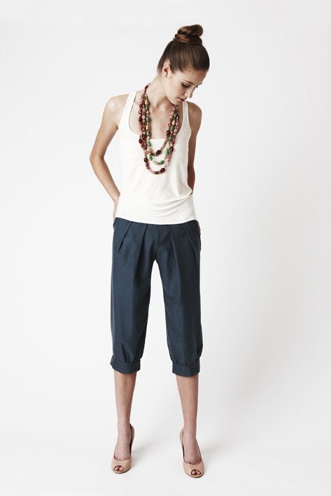
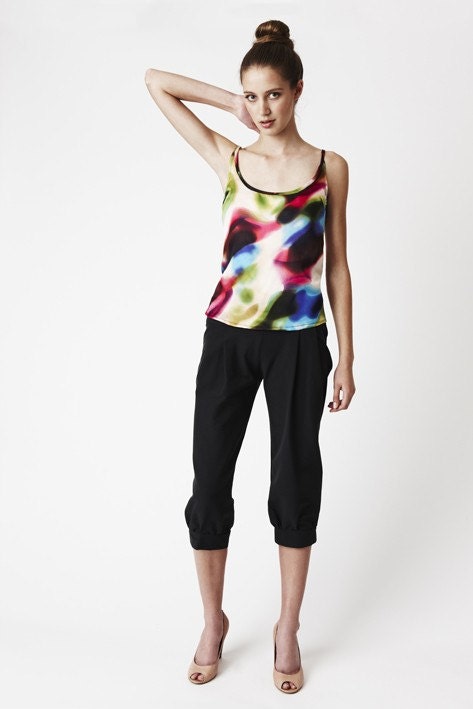
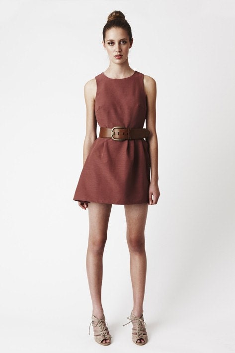
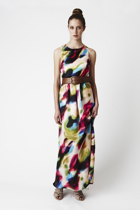
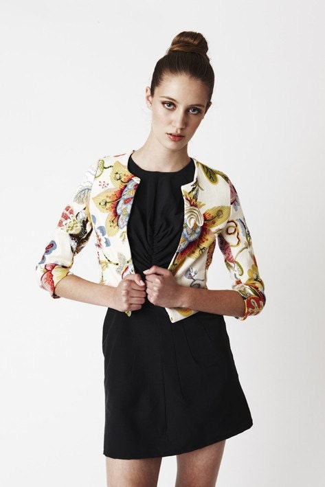
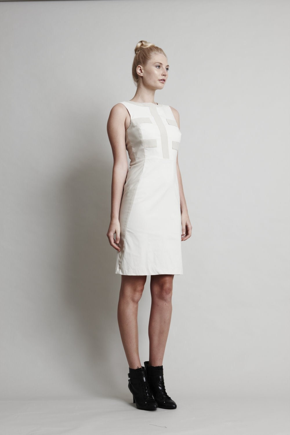
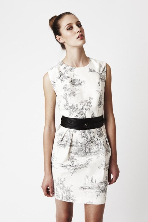
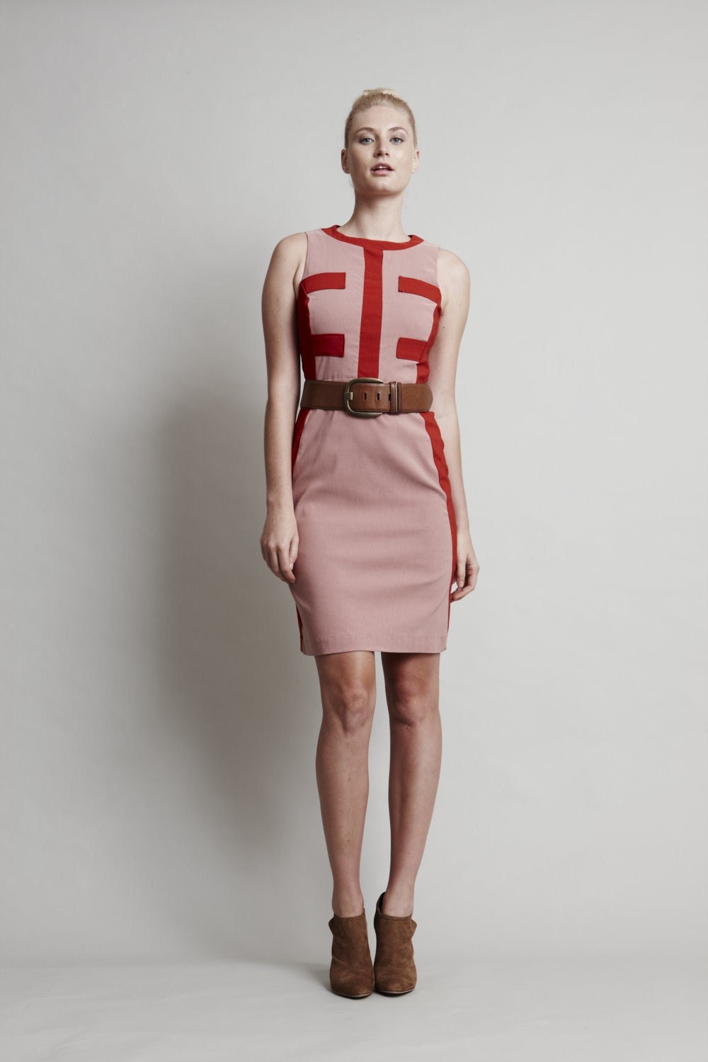
Well, furniture is flying around here after the last post and Shannon's awesome suggestions - I hope you will check back to see the results and let me know what you think.  In the meantime, I give you some more Etsy magic!  Not jewellery this time - instead I am drooling over the styin' fashion from Three Little Ducks.  This boutique fashion label full of hand-crafted pieces is run by Katherine Humphery and Patrick McDermott out of Sydney, Australia. The beautiful pleated pedal-pushers above are what first caught my eye, so clean and classy but still unique.
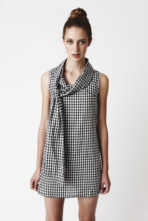
My legs could not carry off the length of this lovely gingham dress, but oh how I wish they could...

Yes, yes - I am AWARE that it is now officially Fall, and these clothes are decidedly summer, but my heart is clearly not there yet.  Maybe I need a vacation in Australia?

Design Dilemma

These photos are terrible, but I wanted to illustrate one of my most befuddling design dilemmas.  Our main floor consists of this one long room, and I love the openness of it, especially now that our kitchen has become part of the room.  However, that big long wall has me stumped.  How do I differentiate between the living room and the dining room?  Or do I even bother?  Do I fill up that empty space, or leave it? How do I make one room flow into the next without making it just one big rumpus room (which let's face it, it is!).
Behind the sofa I currently have the kids little craft/snack table, and that teak side board is stuffed with craft supplies.  The back area by the door of course gets a lot of traffic, especially during the summer.  I did have a rug under the table but with the two messiest eaters in Canada living under our roof, I moved it down to the basement.
My latest idea is to put six matching white frames there - I was thinking I could perhaps use my own photography, either of the kids or of the more artsy flower-type shots.  I am hoping that they would make kind of a 'focal point' for the dining room to balance the mirror/fireplace combo in the living room.
I put up the paper to get an idea of where I would put them and what size they are - there was no measuring or science to this mess (only the top 3 are the actual size of the frames)!  I think they would go a little lower, and slightly closer together.  But what should I centre them on?  I guess the table, but we move that from time to time... And is six enough or should I do eight?  Or is this a truly dumb idea?  Help?

Mobile Options

It is no secret that I love mobiles - in fact most people I am sure realize that I had 2 kids just to start a mobile collection.  I actually have more mobiles than I have space to hang mobiles.  My favourite is the one I "made" in Cam's room above (I didn't really make it - my friend Karen did all the work of origami and I just clipped them to the pre-made mobile I got at Urban Outfitters).  Some day I will document my full collection - until then I will continue to expand it.  One of my favourite sources is The Paper Place on Queen West, and I see that they not only now stock the photo clip mobile I used above above (and all the paper that the cranes were made of) but also some beautiful mobile kits.
Ahhh, just look at this beautiful 'As The Crow Flies' kit from Canadian design duo Contexture Design. It is made from salvaged maps and recycled card stock.  Here are a few more images from the Contexture site, including some other mobiles they make:
The Paper Place also carries these ready-to-assemble kits from Petit Collage (who also have a great line of bamboo mobiles you should check out).
Birds in Flight kit from Junzo Terada is another bird option, with stylized birds flying around a sun/moon centre.
The book Mobile Art by Ayako Akazawa and Michelle Clair is full of modern shapes and animals that you can cut out and string together however you wish.
I definitely think I might be stopping by The Paper Place in the near future, although I could just head over to their beautiful and super-stocked online store to add to my collection!  Anyone else have a ridiculous collection?


(Photos from The Paper Place Blog, Contexture Design, and Wicked & Weird).