Showing posts with label decor. Show all posts

Here Comes the Sun!


Is it possible to get drunk on sunshine?  Because I feel like I have been the past couple of days - stumbling around all squinty-eyed with a big grin, saying things like "oh it's just so BEAUTIFUL!" and "just look at the SKY!" and "I love yoouuuuu....."  I mean, it could be the wine I had with breakfast, but I'm thinking it's the sun.

There is something about yellow that just makes a person smile, no? I have some new yellow tulips stuffed in a vase in the kitchen and they just put me in the best mood.  They're so damned cheerful.
The way they brighten the space makes me want to switch out all my accents to yellow for spring. Candles, paint some wooden candle sticks, pillows, artwork, a throw... I mean not too much because that's just obnoxious, but little bits here and there to make everyone smile.

These paint colours are just the sort of shade I have in mind.  They would look pretty in a powder room, or a sun room, or maybe inside a closet or bookshelf!

1. Pratt & Lambert Shantung
2. Benjamin Moore Butter
3. Sherwin Williams Fun Yellow
4. Behr Lively Yellow
5. Benjamin Moore Hawthorn Yellow
6. Benjamin Moore Moonlight Natura
7. Behr Lemon Souffle
8. Benjamin Moore Lemon Sorbet
9. Benjamin Moore Sundance

Side note: It's so crazy how colour is not an absolute.  All of these yellows look completely different when you put them beside other yellows than they do when you see them on their own or with another colour. The Sherwin Williams colour (3) looks almost green here but seemed like such a sunshiny yellow in my file.  And they all look way more pink than they did in my Photoshop!

Of course, there's always wallpaper too - maybe because we had pretty yellow wallpaper in my front hall growing up, I always think fondly of yellow wallpaper.

How gorgeous is this Thibault wallpaper as seen in Better Homes & Gardens?
or this stunning Harvest Hare wallpaper?
I can't find the source on this other than here - any ideas?
pretty Farrow & Ball wallpaper from a Design*Sponge tour
If a whole wall seems extreme, what about putting a frame around it?

How fun is this Graham & Brown wallpaper?
more Farrow & Ball yumminess
and more!

For an effective splash of colour, one could always paint a door yellow - I love how happy they look. Too bad we have aluminum and glass doors...

via Simply Grove
via Modern Maggie
via jdrushphoto
via Apartment Therapy
via Real Sliding Hardware
via Remodelista
via The Art of Old
And of course, you can always count on Etsy when you need a spot of colour.  Etsy never disappoints.

Poster, Pillow, Shower Curtain, Light, Bedding, Vase

Yellow: I think you get the idea.  Have I convinced anyone? And now instead of looking up yellow on my computer, I'm going to go out and enjoy the sunshine!

Peace out.

Catching up


Well HELLO!  It's been a while, so I thought I would catch everyone up with a picture-filled post.

Let's start with skiing. One of my favourite things about being out here in Calgary is skiing.  The hubster told me this would happen, and next time he tells me something... I'm still not going to believe him.  But about this he was right.  I have never been a skier - I just was never really close enough to a hill to warrant buying the equipment and going regularly.  Plus, I was an artsy-fartsy - I didn't think skiing was in my repertoire.  But since I was forced to get gear, buy a season pass, and get up at the crack of dawn to get to the hill - I have gotten pretty good!  And being good at something, or at least reasonably good, is key to enjoying it, in my opinion.  Although they have never been on skies before, the boys are naturals, of course, especially Will.  I thought they would be on the bunny hill all this season, but we have already passed that and are doing chair lift runs.  So fun!

Pretty hoar frost is really common.

So winter here has come and gone, come and gone. Chinooks are REAL people - not just some nebulous thing that everyone kept telling me about to make me feel better about moving.  They're real, and they are spectacular!


Christmas happened, and my folks were here for a month.  It was a fabulous visit and a great holiday, and I think my parents were excited to sleep on a real bed instead of blow-up mattresses (Which was our 'guest room' in the old house).

You can't win 'em all...

Nenshi was kind enough to give me this great book for Christmas (haha) and we went on a few excursions with my parents.  We saw lots of dinosaur bones,


and hoodoos,


did more skiing,


and even made some pizza (but wouldn't eat it).


Chris and I got to have some 'date' time, which of course with Mountain Man means snow-shoe hikes.  Pretty amazing way to see the mountains, so I guess I won't complain.  There was wine too.


Since I wasn't blogging I had lots of time to do some knitting projects, including a few I didn't photograph.  I made up the pattern for the long scarf I gave to my mother-in-law and was pretty happy with it. I got confident enough to print out a sweater pattern, but haven't started it yet.  It scares me.


On the home front, having Dad here spurred me on to accomplish at least one project, which I'll do a separate post about later.  Here is my fancy drawing though.


I continue to be amazed by the spectacular sunrises and sunset out here.  Big Sky is right!


Someone had a birthday...


and I started a painting class.

Our first class we learned how to mix paints and do a quick apple - 10 minutes!
I have also slowly but surely been making it a little homier around here.  There are still lots of pictures to get hung, furniture to be positioned, and some painting to be done, but I am pleased with the boys' room.  The polka dots are my way to liven things up without painting (i.e. lazy solution).


Some day I will get to have a real tablecloth again... you know, those fabric ones?  Without plastic on top? Yeah, I like those.  Some day...

So that's what's been up in my world out here near the mountains.  I hope you guys are staying warm, and are having a happy 2015 so far!

Abandoning perfectionism

Setting up this house has been a bit of a process for me.  As I wrote a few months ago, I found the modern design and aesthetic of the house intimidating, and I have been struggling to "make it mine." Many of my things have been easy to place, and I am happy with how they go with the house.

Others just don't match up in my mind's eye - usually older pieces that I have moved from house to house and never really looked at, if that makes any sense.  The bed, for example.  I have always loved wrought iron beds, something about the deep black colour with soft curves and curlicues.  I even did a post about them in 2009 (before I knew anything about referencing images, obviously).  When I bought my bed way back in I-don't-even-remember, my only real sources for furniture were my parents' house and Ikea.  Since my parents didn't have any extra queen beds kicking around, it was off to the that big blue and yellow store, and I came home with this:


(I went to find it on the Ikea site, but apparently it is no longer available - which means I must have bought it a while ago!)

It isn't too bad, but there are a few things that bug me about it:
- it is so obviously from Ikea
- the curved line on the top of the headboard - I wish it was straight like the footboard
- those round curly flower things - not sure what it is about them that bugs me, but I think they just seem too cutesy and busy.

The poor bed bothered me in the old house as well, but when we put it in the master bedroom in the new house, it just didn't work for me at all.  I feel like this room is begging for a big upholstered bed.

Now it would be lovely to put all the stuff that bugs me up on Kijiji and go out and buy exactly what I want, but sadly, they forgot to plant that money tree in our new back yard.  So instead I used some West Elm gift cards I had for the Steven Alan euro shams and long grey pillow, and splurged on an Ikea linen duvet cover and wool pillow from Winners.


Aaaand I still don't like it.  And there still is nothing over the bed.  And I am debating about curtains. And I still don't love the colour. I feel like this room will never be finished. (Cue the violins!)

However, it finally hit me this weekend that if I wait to share photos until the rooms are "DONE", I will never blog again! So instead of beautifully-styled rooms that I am proud to share, you are going to be getting a lot of photos of not-quite-there-yet rooms that I am not yet happy with. Maybe just posting the photos will spark a moment of genius and I will figure out what the heck to do. Or maybe you guys can give me some suggestions.

Either way, I am just going to have to decide to be OK with the bed, the sofa, the colours, and the bookcases in the basement. I am going to have to be OK with living in a partly-finished house. Which means, I am going to have to be OK with having a blog that is a chronicle of making this house my own, warts and all, instead of a fancy portfolio of my impeccable style. While I would love to post about putting a room together from scratch, that just isn't realistic.

Insert deep comment about embracing the imperfections in life, then post inspirational tee photo.
T-shirt $30 at Tees in the Trap

Thanks for sticking with me folks! :)

Building a design portfolio


As I launch into this interior design business, I realize that if I am going to go beyond friends and family, I am going to need to put together a professional-looking portfolio.  I am finding that this is hard to do in retrospect because the perfect "Before" shots may not exist, and I am not sure that my photography skill level is up to the best looking "After" shots (understatement).

I thought I would start by putting something together about my own kitchen first, since I have oodles of photos. None are styled the way I would like, but beggars and can't be choosers, and I am way too lazy to do that now. There is nothing like looking at your space on a photograph to really force you to take a step back.  For example, in the first photo my Breville espresso machine would be way better than that fugly toaster oven.  The chair and table are distracting in the corner.  The thermostat on the window sill needs to go and the whole counter, window - everything could be styled better.  I do like the splash of red/orange though.  Otherwise the kitchen is pretty bland in a photo.


It is also difficult to match up the angles of the before and after shots, but hopefully you can tell it is the same space.  It looks so wildly different to me, it's not even like looking at the same house!


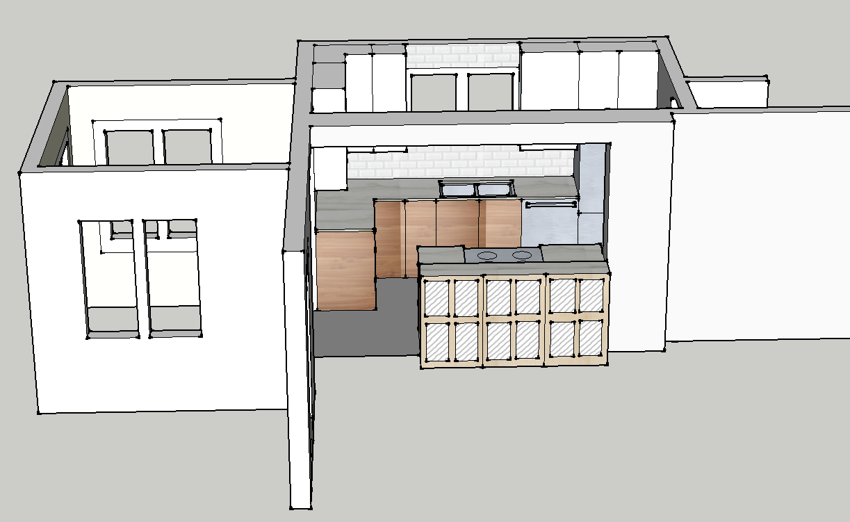
And then there's the drawings.  Do I add the drawings?  Are they part of the portfolio?  Do I add the final one or all the layouts I played with to get here?  I tell you, I pretty much did a masters degree in this SketchUp program by the time I was done this...


And I didn't do an inspiration board for myself, but I guess I should put one together in the style I would present to a client...

Anyway, thanks for reading.  I am excited to be moving forward on this. I have to say, Sarah Richardson's post on Facebook this morning was exactly what I needed to hear, and really got my butt in gear.  I even have found a photographer to do some of my other projects, hopefully they will end up way more profesh!  And the more I realize I have already done, the more I realize that the only thing holding me back is a lack of confidence, not a lack of ability.  And that just seems silly, now, doesn't it?