Showing posts with label typography. Show all posts

A Book by Its Cover

My mom picked up this book by Iris Murdoch to read the other day and I just loved the cover illustration on this Vintage Classics edition.  The colour on my Instagram shot doesn't really do it justice.  Wouldn't it make a cool poster?  They sadly don't mention the artist, but it would seem that Vintage Classics is known for their modern and contemporary covers for classic English novels.  Here are a few I particularly liked from their site:
I like that they keep to a very specific look for each author.  The Medea one gives me the shivers, knowing the story, and the Kafka ones are perfectly, well, Kafka-esque.  Have you read any of these?  Do you ever judge a book by its cover?

Free Father's Day Printables from Hello Lucky

I love these great labels and cards for Father's Day from Hello Lucky.  It's a nice way to snazz-up that bottle of wine you ran out and got at the last minute because you forgot Father's Day was coming even with all the advertising because advertising is just noise and now you feel badly that you didn't even force the kids to make a card let alone buy him anything that truly honours what an amazing dad he is but maybe if he drinks the whole bottle he won't feel so sad - don't you think?
Beer labels too. Nice work Ladies - I owe you one.

Fun with Fonts: Lost Type Co-op

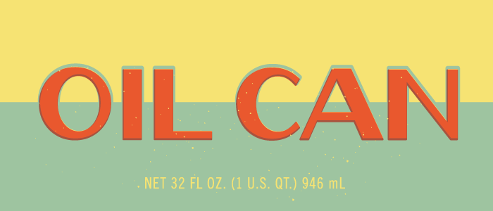
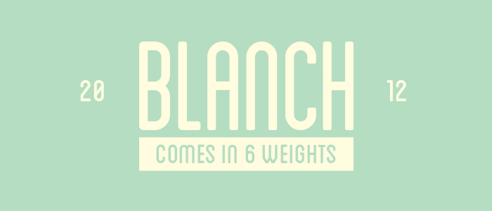
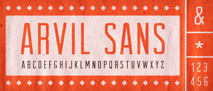
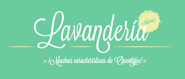
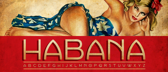
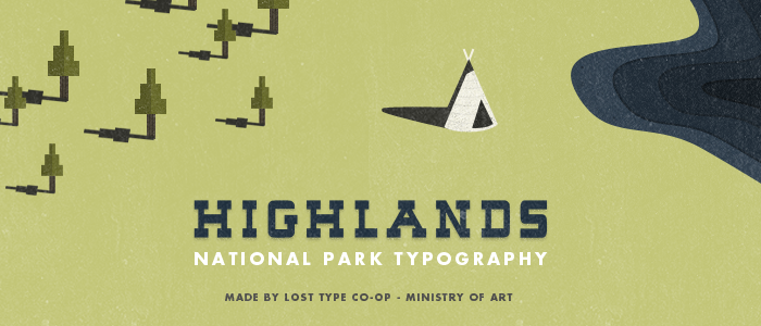
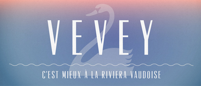
Lost Type Co-op is a font-sharing site where you buy fonts using the pay-what-you-can method, and the font designers get 100% of any earnings from their design.  The fonts on the site are very retro-cool, often inspired by vintage posters or packaging. Here are some of my favourites, including Oil Can above, designed by Ellis Latham-Brown.  Click on the image to go the the font purchase page.
So tell me, do you have a go-to site for fab fonts?

Sign of the Times

I love these 'ghost sign' photographs by UK photographer Tom Bland.  They remind me of some of the ones you used to be able to see in Saint John, especially a big Red Rose Tea one - was it on Prince William?  Wonder if they are still there... may have to make my own series when I get back to NB this summer!
Mr. Bland (shall I call him Tom?) had graphic designers as parents and was raised watching them at work. In his own words:

My parents are graphic designers, working as a duo from home in rural Northumberland. I grew up watching them go about their work on a big drawing board using a scalpel, spray mount, kappa board, acetate and letraset. [...] They’re now fully Mac-based of course, as I am myself – but when I think back to how they used to work it never ceases to amaze me how they were able to create what they did and work that way.
Ghost signs (as they are most commonly known) began to catch my eye when I moved to London, and I inevitably found it fascinating to think about how they’d been created and the level of skill and craftsmanship that was involved. I later realised how attractively some of the signs I was seeing had aged. I was seeing layers of typography, paint, colour – and combined with the texture of the crumbling and flaking materials, many of them were appealing to me as looking like contemporary pieces of design in the vein of work by the likes of Tomato or Ray Gun magazine. I felt that if these faded remnants of the past I was seeing around me were used on new book jackets or record covers for example, they would stand up incredibly well against a new piece of work, the signs having evolved and aged completely naturally in ways that contemporary designers or illustrators often emulate.
[...] Aside from the design and craftsmanship element, I love how ghost signs temporarily teleport you into the past, to a time when there were no digital billboards cluttering our view of the city. Having grown up in the countryside I often find myself wishing I didn’t see the visual pollution of advertisements everywhere I turn and wonder what it would take for London to emulate São Paulo and place a ban on billboards.
For the full quote, and all of his amazing "Sign of the Times" photographs, please check out his Flickr page or his website.
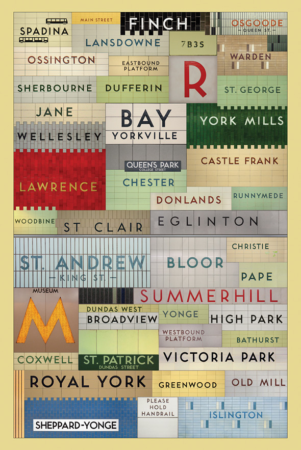
Toronto Transit Font

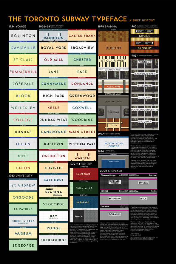
I love love love this beautiful poster by graphic designer Jonathan Guy of all the TTC (Toronto Transit Commission) stations that use the original 1950s font.  I saw it on the wonderful BlogTO, which has a great piece on all the fabulous Toronto maps out there as well as this later post on Jose Ongpin's 2006 project for OCAD about the typographical history of the TTC, featuring this great poster:
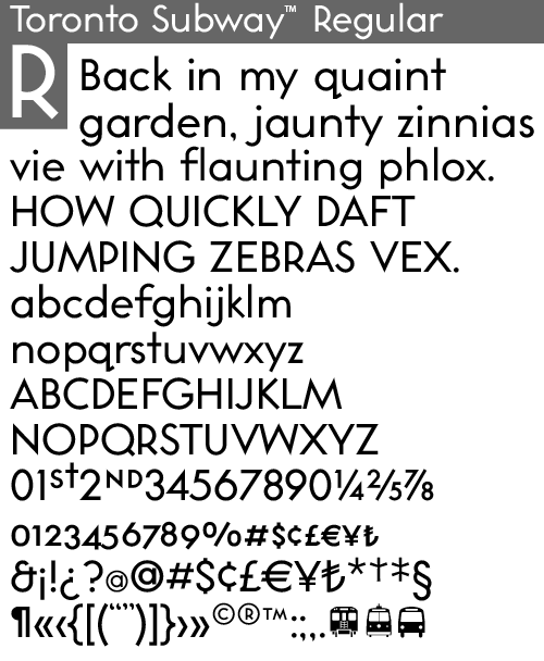
It is worth a look!  For those typographic geeks out there, here is the Toronto Transit font: Toronto Subway Regular, from Quadrat:
They made it from rubbings of the letters on subway walls and photos.  It is kind of sad that the newer TTC stations no longer use this great font.  All the articles have a ton of links to more and more info on the history of the design of transit in Toronto - which is not as boring as it sounds!

They remind me of the great buttons put out by Spacing Magazine of the TTC stations - which the National Post declared "the civic pride fashion statement of the year" in 2005.  Now if only they could put more trains on during rush hour...

cool font, eh?

This awesome font, created by 10four design group in honour (with a 'u' - thank you very much) of Canada Day, is an amazing tribute to Canadian stereotypes and references.  What other font can teach you that a Canadian invented insulin, alkaline batteries, the goalie mask, the paint roller, and the jolly jumper?  It was only recently that an American colleague explained that he didn't know what a toque was... who knew?  The font has upper case, lower case and numbers too, and if that weren't great enough - it is FREE.  Geez, Bob and Doug would be some proud, eh?
 Seen on The English Muffin Blog.

Therese Sennerholt

I can't remember where I saw the designs of Therese Sennerholt (maybe See Saw?) but her site is as lovely as her prints.  The designs are so striking, and the styling of the photos is beautiful.  I am still kind of on the fence about word art, but some of these are very tempting (until you convert from SEK!)  Here are some shots of her site and her works:
This one above NEEDS to be owned by my friend Kate.