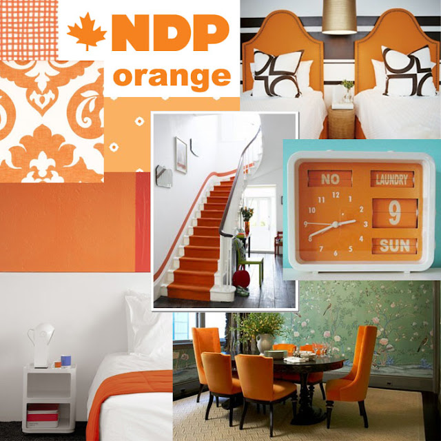
All this election excitement got me thinking about... uh, design, of course. I thought I would do some mood boards inspired by the colours of our political parties (pretty patriotic, eh?). Then I started thinking how strange it is that red is for Liberal in Canada, but Republican in the States; and that Blue is the Conservative colour here, but means Democrat there.. I wonder how these things developed? Anyway, that is for another post, and since I spent WAAAY too much time on photoshop putting these together, I simply don't have the energy to tackle all that. In fact, I was getting so tired by the end that Green only got one board - nothing personal Green party! Go Lizzie May!


Obviously, none of these colours can work on their own - everything in moderation (including moderation!). Blue looks better with some pops of orange, don't you think? (See what I did there? Design blogger/ Political pundit...) In fact, I think we might want to start getting used to the following combo of complimentary colours, don't you?
Um, wow, this post took me forever!! Photoshop is way too addictive.


Looks like we will be having mostly blue with some pops of orange in real life as well. Wish it was the other way round!
ReplyDeleteAmy
You are rocking the mood boards like no one else! I'm uber impressed and jealous of your skills! ;)
ReplyDeleteWhat a fun post!
ReplyDeleteoh man these are good. Thank you for the lovely eye candy! xo
ReplyDelete