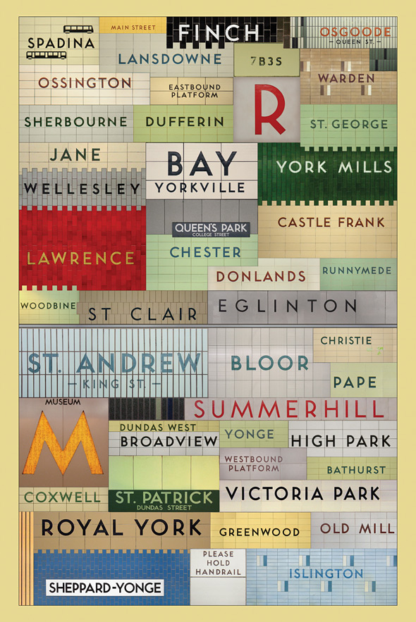
I love love love this beautiful poster by graphic designer
Jonathan Guy of all the TTC (Toronto Transit Commission) stations that use the original 1950s font. I saw it on the wonderful
BlogTO, which has a great piece on all the fabulous
Toronto maps out there as well as
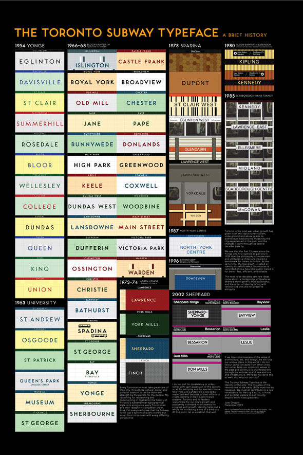
this later post on Jose Ongpin's 2006 project for OCAD about the typographical history of the TTC, featuring this great poster:
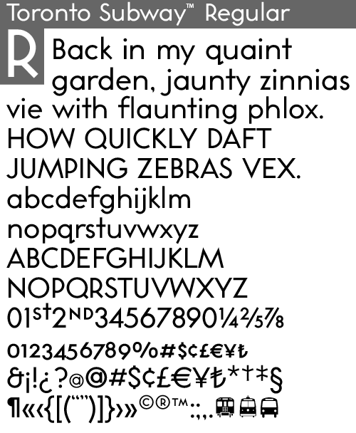
It is worth a look! For those typographic geeks out there, here is the Toronto Transit font: Toronto Subway Regular, from
Quadrat:
They made it from rubbings of the letters on subway walls and photos. It is kind of sad that the newer TTC stations no longer use this great font. All the articles have a ton of links to more and more info on the history of the design of transit in Toronto - which is not as boring as it sounds!
They remind me of the great buttons put out by
Spacing Magazine of the TTC stations - which the National Post declared "the civic pride fashion statement of the year" in 2005. Now if only they could put more trains on during rush hour...


it is sad that the font is no longer used.
ReplyDeletei LOVE that Jonathan Guy poster...fabulous.
Great post. I love the age of the subway lines and really wish they'd continue with heritage trademarks. That poster is definitely my next purchase.
ReplyDelete