Crayon Hearts


This weekend the hubby went away and the boys and I had some Quality Time together. I would just like to say how much respect and admiration I have for actual single parents, especially those who have to work one or more jobs.  I knew my husband and I were a good team, but you just don't realize how much you depend on each other until your team mate skips town.

Anyway, we did do a few activities besides Netflix...  I had bought a silicone heart mould at the dollar store before Valentine's Day and the boys have a bucket of crayons they never use - they are straight up marker dudes.  I had seen lots of tutorials about melting down crayons and when I suggested it they were pretty excited.  I won't describe the whole process, since there are lots of tutorials online, but the essentials are:

  1. Take paper off crayons: this is kind of tedious and your kids will abandon you and your nails will never be the same again.
  2. Break crayons into little pieces:  or not so little, depending on your hand strength.
  3. Put them in the silicone mould: if you want hearts that are actually shaped like hearts, you may want to skip the dollar store and invest at, say, Walmart.  (Our mould was promptly chucked in the garbage after this craft, and I am relieved to say that none of it remained in the oven.)
  4. Back up 3 steps and set the oven to 200 - 250 degrees.
  5. Once your oven has heated, put the mould on a baking sheet and pop 'er in.  Plug your nose and watch them melt, slowly, for about 15 - 20 minutes.  Open windows.  Wonder how many toxins are in crayons and look worriedly at your children.
  6. Put them on the back porch to cool down.
  7. Ooh and Aah as you pop them out of the mould and watch your kids colour diligently until they remember they don't like crayons, get bored, and go watch Netflix.


The weird thing was how the pigment sank to the bottom and all the extra (filler?) wax pooled at the top.  I assume that these were probably not top-of-the-line crayons... I didn't remember anyone mentioning this online.


Me being me, I took out a paring knife and shaved off the extra wax. Then I noticed the shaving were kind of pretty so I took photos.  Then I went and got my hair dryer and experimented with melting the shavings onto paper and canvas.  They looked sort of pretty until they got quite liquidy and the green overpowered all the other colours.  The result sort of looked like someone barfed on a canvas.  I didn't take photos.  But it was kind of fun to get my hands dirty and play around. I also noticed that the heart crayons made it into their stories and play for the rest of the weekend (I think at one point they were alien space ships) so I am calling it a successful craft.  :)

Building a design portfolio


As I launch into this interior design business, I realize that if I am going to go beyond friends and family, I am going to need to put together a professional-looking portfolio.  I am finding that this is hard to do in retrospect because the perfect "Before" shots may not exist, and I am not sure that my photography skill level is up to the best looking "After" shots (understatement).

I thought I would start by putting something together about my own kitchen first, since I have oodles of photos. None are styled the way I would like, but beggars and can't be choosers, and I am way too lazy to do that now. There is nothing like looking at your space on a photograph to really force you to take a step back.  For example, in the first photo my Breville espresso machine would be way better than that fugly toaster oven.  The chair and table are distracting in the corner.  The thermostat on the window sill needs to go and the whole counter, window - everything could be styled better.  I do like the splash of red/orange though.  Otherwise the kitchen is pretty bland in a photo.


It is also difficult to match up the angles of the before and after shots, but hopefully you can tell it is the same space.  It looks so wildly different to me, it's not even like looking at the same house!


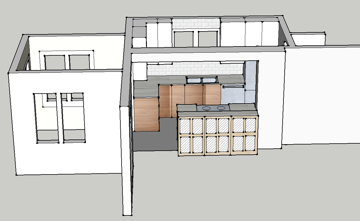
And then there's the drawings.  Do I add the drawings?  Are they part of the portfolio?  Do I add the final one or all the layouts I played with to get here?  I tell you, I pretty much did a masters degree in this SketchUp program by the time I was done this...


And I didn't do an inspiration board for myself, but I guess I should put one together in the style I would present to a client...

Anyway, thanks for reading.  I am excited to be moving forward on this. I have to say, Sarah Richardson's post on Facebook this morning was exactly what I needed to hear, and really got my butt in gear.  I even have found a photographer to do some of my other projects, hopefully they will end up way more profesh!  And the more I realize I have already done, the more I realize that the only thing holding me back is a lack of confidence, not a lack of ability.  And that just seems silly, now, doesn't it?


Back in it with Waterlogue


So, my Blogger dashboard tells me that I last posted December 9.  That's a while ago.  I won't go into too much about why, where I was, or what I was thinking - there are some great posts that sum it up so well by Grace Bonney, Jen Flores, and Janice.  Suffice it to say that it became a lot of work, a big time investment, and I was just not that into the new 'direction/professionalization' of blogging for myself.  I like to just throw stuff up that I think is pretty.  I include photos of my kids.  I don't really fit in a niche, and, having tried, I don't really want to.  I was all set to "take this thing to the next level" with a new Word Press site, fancy hosting, plug-ins, SEO, bla bla bla... and then I just stopped.  Stopped writing, stopped reading blogs, stopped spending all my waking hours looking at the computer.  I have read a LOT of books in the mean time!

But I kind of miss it.  I say 'kind of' because I don't really miss all the techie stuff, much as I liked it. And I certainly don't miss looking at my numbers, that stresses me out.  And I don't miss all the emails asking me to review things, blog about things, let other people write on my blog, etc.

I miss having a place to post stuff I like in a more thoughtful way than pinning it on Pinterest (which I still love).  When I post things here, I am forced to ask myself why I like it, and what about it speaks to me.  And here I can post about design, products, apps, crafts, colours, fashion, environment, music, you name it - it's my freakin blog!

So if you are with me, awesome, I love you, and I am grateful for your company.  If you are no longer feelin the love, that's cool, carry on, I'll be around if you change your mind.

But now, on to the main event, the reason I opened up this posting thing again: Waterlogue.

I know it's cheating, but hey, so is Instagram.  I know I am not actually a fabulous watercolour painter artist-extraordinaire, but I get to imagine how awesome I would be if I had the skills.  Just like with Instagram, I get to feel like a real photographer, capturing magical moments in time with just the right je-ne-sais-quoi. (On that topic, you must watch this hilarious video: http://youtu.be/5i9wUa8ofvE)

You will see from my heading at the top I have a huge love of watercolour.  Watercolours happen to be very "hot" right now - the loose impressionistic aesthetic is similar to the current rage for hand-written fonts over structured typefaces.  The artistic, the individual, the one-of-a-kind is refreshing in a world of cookie-cutter everything.

The irony of this is that you are no doubt going to see Waterlogue used EVERYWHERE now - your Instagram feed is about to go all David Milne.


This is my son at a recent Toronto Symphony Orchestra student concert (field trip).  I am just so blown away by the treatment of this app, the fidelity to real watercolour techniques and effects.  The photo above looks like it could be an illustration in a kids book.


So there you go: Waterlogue.  Best $2.99 I have spent in a while! :)

Thanks for reading. xo

Yao Cheng Design


Yao Cheng Blue Waves print from Wicked and Weird blog
Blue Waves

I was cruising around the internet the other night looking for inspiration for a silkscreening class I am doing and came across the beautiful work of Yao Cheng.  I just love the pretty pinks (never thought I would say that!) and soft watercolours paired with her beautiful hand lettering.  Her patterns and prints are just lovely as well.  There is so much talent out there it constantly amazes me, and just when I thought my days of blogging might be done, I find a slew of incredible artists I feel like I just have to share.  Also, I would like to take a watercolour course next!
Yao Cheng abstract circular shapes from Wicked and Weird blog
Abstract Circular Shapes
Yao Cheng floral wreath from Wicked and Weird blog
Floral Wreath

Yao Cheng Colorful Dots Falling print from Wicked and Weird blog
Colorful Dots Falling 

Yao Cheng Landscape Forest in Indigo and Greenprint from Wicked and Weird blog
Landscape Forest in Indigo and Green
Yao Cheng Triangle Shapes Light print from Wicked and Weird blog
Triangle Shapes Light
Yao Cheng custom postcard from Wicked and Weird blog

Inspired by Elle Decor's December edition

Original photography by William Abramovitch

Have you ever found a new shelter magazine in the mail, drooled all over the cover, made yourself wait to open it until you were comfortably nestled with a cozy throw and a glass of wine, and then flip, flip, flipped to the end without being stopped by anything inside?  That did NOT happen today when I got the December Elle Decor in the mail.  I was so excited I actually put down the wine and took photos of the photos in the magazine.  I know.  There were a few homes and designs that, while I appreciated the aesthetic, did not appeal to me.  But the St. Bart's beach house of Parisian interior and furniture designer Christian Liaigre pictured above had me already feeling the humid breezes and hearing the sounds of the surf.  Who knew a beach house could be sophisticated?  I love the kitchen and the bathroom especially, and the outdoor eating area (which I didn't show - you have to look at the magazine for that one - trust me it is beautiful).


It could be that the editor Michael Boodro's letter hit the nail on the head for me - I have often wondered how I could be attracted and happy with so many different styles of design.  Shouldn't I have one signature style?  Michael says no.  Boo-yah Michael.


For example, I would have no where to put this amazing light fixture - it does not jibe at all with the things I have in my home - but I covet it none-the-less.  How does this make sense?  Sooo shiny...


My photo does not do justice to the rich, yummy, deep velvety green on this sofa in the ad for Ochre.  It is actually much darker.  I tried to find it online but no dice.  It's that amazing mossy forest green that you feel like you could fall into and dream of fairies and sprites in magical German woods.  Or something...  But when I saw it I knew immediately that THIS is going to be my colour this Christmas - this rich deep velvet green, with cream and gold and white and lots of sparkly little lights.  Think Value Village has any deep green velvet...?  Perhaps velour will do in a pinch, provided I maintain low lighting at all times.

Original photography by Eric Piasecki

Much of this "cabin" (monstrous home) in Colorado designed by Caroline Sarkozy was a little contrived for my taste - too much birch bark, antlers, and pine cladding for my liking.  But for some reason I enjoyed this cozy home office pictured above - a photo tucked away on the contents pages ...maybe I would just add some books to those shelves.

Original photography by Jean-François Jaussaud 

Another little snapshot from the contents pages was this beautiful curved nook found in a chateau in Provence owned by the designer Pierre Yovanovitch.  The rest of the chateau was very nice in an overt modern-minimalist-luxury-in-an-historic-French-chateau kind of way, but everything about this image appeals to me much more.  The curved wooden shelves on the curved wall, the rustic dishes, the wooden-framed painting, the two-toned wall, the delicate antique rocking chair - c'est parfait.

Original photography by William Waldron

However, the home I could move into in a heartbeat and change NOTHING is this fishing cabin-turned weekend house designed by Amy Mellen, creative director for Calvin Klein Home.  Just look at the mix in this kitchen.  Sleek cabinets, faucet, stainless appliances, and Calvin Klein windsor chairs - with their modern angles and lines - pair so perfectly with the antique table, original pine floors and dark-trimmed sash windows.  And such great styling by JC Garcia Lavin!


And that bedroom is just so serene and right up my alley.  In fact, I think that might be the colour of my bedroom walls.  If only I didn't kill those weird ferns every time I buy one.  Again the mix and styling in this photo (or at least the actual photo in the magazine) are great. (Wait, wasn't that fern on the mantel before? Maybe they aren't meant to live - maybe they're just for styling!)

So thanks for letting me read the magazine for you, and thanks to Elle Decor for actually inspiring a blog post.  That's no small miracle these days!

Happy Birthday Joni Mitchell

Joni Michell 1970
Joni Mitchell has to be one of my top ten favourite musicians of all time - maybe even THE top.  Her songs are unusual and inventive; poetry set to music.  She turned 70 years old yesterday, so I thought I would post one of my favourites of her songs - I love pretty much everything about this one.  Her guitar playing is incredible, the lyrics are thoughtful and evocative, and her voice just ripples over the melody like sparkling clear water.


Rolling Stone called her "one of the greatest songwriters ever" and I completely agree.  She is also a painter, and in fact she has said that she considers herself a "painter derailed by circumstance."  I have always felt that Joni is a true artist - a kind of human conduit for creativity of the style Elizabeth Gilbert describes in her TED talk.

I have a this theory that there is magic and mystery and music all around, available to us if we sort of shift our "frequency" to let it resonate through us.  I am sure you have felt it every now and then, no? Since I am a visual person, I see it in my head in terms of density - I imagine that some people are more opaque than others - there is just no space in them for the magic to get in or through.  Each of us are varying degrees of opacity, at different times, and artists of any vocation simply have less mass in them... they're "thinner."  Joni is a rare being that is practically transparent, or like a crystal - the magic/art not only comes through clearly, but is amplified as it shines through her.

Did that make any sense?  Did I just write all that?  Jeez, put the joint down Lisa... (although I will leave it in because, heck, were talking about Joni).


Anyway, I also want to include the lyrics to another favourite song of hers, Chelsea morning.  I always play it when I'm feeling blue, and it never fails to make me smile.  For the longest time I always had yellow curtains in the bedroom so I could wake up to a Chelsea morning. :)

Woke up, it was a Chelsea morning, and the first thing that I heard
Was a song outside my window, and the traffic wrote the words
It came a-reeling up like Christmas bells, and rapping up like pipes and drums

Oh, won't you stay
We'll put on the day
And we'll wear it 'till the night comes

Woke up, it was a Chelsea morning, and the first thing that I saw
Was the sun through yellow curtains, and a rainbow on the wall
Blue, red, green and gold to welcome you, crimson crystal beads to beckon

Oh, won't you stay
We'll put on the day
There's a sun show every second

Now the curtain opens on a portrait of today
And the streets are paved with passersby
And pigeons fly
And papers lie
Waiting to blow away

Woke up, it was a Chelsea morning, and the first thing that I knew
There was milk and toast and honey and a bowl of oranges, too
And the sun poured in like butterscotch and stuck to all my senses
Oh, won't you stay
We'll put on the day
And we'll talk in present tenses

When the curtain closes and the rainbow runs away
I will bring you incense owls by night
By candlelight
By jewel-light
If only you will stay
Pretty baby, won't you
Wake up, it's a Chelsea morning

Finally, I heard part of her interview on CBC with Jian Gomeshi yesterday and it was so interesting - she's such a weirdi-cat. Man, I love her, can you tell?  http://www.cbc.ca/q/blog/2013/06/11/joni-mitchell-portrait-of-an-artist/.

Happy Birthday Joni!

Ai Weiwei Exhibit at the AGO

Ai Weiwei art retrospective at the AGO According to What? from Wicked and Weird

This weekend we had the pleasure of hosting my brother- and sister-in-law, who were in town from Kelowna.  There was much food and wine, but we also classed it up with a visit to the AGO to see the Ai Weiwei exhibit before it closed (yesterday).  I am SO happy that I got to see it, it really was amazing.

[Warning: this post got kinda looooong.]

Ai Weiwei is probably best known for being a thorn in the Chinese government's side; I first heard of him during the Olympics when he used the public platform given to him as the designer of the show-stopping "Bird's Nest" stadium to loudly denounce China's record of human rights.  He has been incarcerated, had his studio destroyed, kept under 'house arrest', followed, interrogated, and been beaten to the point of a brain hemorrhage by Chinese authorities.  As you can imagine, his art is completely intertwined with his political sentiments.  I expected to be moved by the messages in his art, but was not prepared to be so moved by the art itself.  It was beautiful, warm, meticulously crafted and aesthetically enchanting.

In most of his works, Weiwei uses traditional Chinese materials and techniques in new, and often subversive ways.  The top left image is of his piece Teahouses, 2011 which consists of three precisely packed and positioned houses made out of tea leaves.  Each house weighs one ton (and needed to be installed by a structural engineer).  The smell of the tea is beautiful, and the effect of standing before such an imposing and heavy piece that is made out of miniscule scented dried leaves is confounding.

Beside it is a close-up of what was an enormous, long piece.  It was created out of Chinese iron wood pillars from a dismantled Qing Dynasty temple.  The pillars (it looks like there were eight?) were fused together using traditional Chinese joinery techniques with no nails or screws holding them together.  This homage to Chinese history and craftsmanship is juxtaposed with a machine-cut detailed outline of China that runs the entire length of the pillars.  As my four-year-old would say "How the HECK...??"  It is oh so beautiful.

Below are enormous traditionally built cabinets made of huali wood (from the quince tree).  The glow and grain of the wood is incredible - if I had been allowed to touch the art I think I might have rubbed my face on it.  What can I say, I love wood.  Below you can see a close-up looking through the holes at the centre; somehow using positive and negative space, the cabinets lined up together show all of the phases of the moon, which is the basis for the Chinese zodiac calendar.

Lastly is a massive snake that was positioned just outside the entrance to the show made of 5,000 backpacks, representing the 5,000 children lost in the 2008 Sichuan earthquake.  Most of these children were killed when their schools, built by a cheap government with absolutely no building codes or safety inspections, collapsed around them.  When the government refused to acknowledge the disaster, take responsibility for the shoddy building construction, or even bother recovering the names of those who died, Weiwei went to the site of the tragedy and launched a door-to-door campaign to discover and honour the name of every single child that died in Sichuan. One wall of the exhibition was a memorial to them and showed every name, date of birth and date of death, while voice read them out one by one.

Another highly effective memorial to the victims of the earthquake is shown below, consisting of the cheap iron rebar found in the rubble of the schools and other buildings.  Weiwei's team painstakingly straightened each mangled bar and placed them together in an undulating river under the quote: "The tragic reality of today is reflected in the true plight of our spiritual existence.  We are spineless and cannot stand up straight." It was very powerful.

Ai Weiwei art retrospective at the AGO According to What? from Wicked and Weird

So I didn't realize that this post was going to be a long art essay on every piece in the show!  I will speed through the Coles Notes of the rest (doing their beauty and impact no justice).  Top left is a nod to the commercialization of the world with the Coke logo painted over an antique Han Dynasty urn: cheap modern advertising desecrating a work of art that had previously lasted centuries. Or is it that the bones and shaped of the past lie under and give structure to everything we do?  Or that the foundations of Chinese culture are strong and can withstand cheap decoration, unlike the bones of the buildings in Sichaun? Discuss amongst yourselves.  Also a nod to pop art a la Andy Warhol.

Bottom right is called Divina Proportione, referencing a drawing by da Vinci with the same name.  Again, his team put this together using only traditional craftsman techniques, which took them over a year to learn.  The joinery was mind-blowing, not to mention the complicated geometry required.  The beautiful wood is reclaimed huali wood, and what I wouldn't do to have one of these in my house... I drooled over them for a good long while.

Ai Weiwei retrospective at the AGO including Dropping Han Dynasty Urn

Above is two works: Dropping A Han Dynasty Urn (in which the artist drops a Han Dynasty urn) and Colored Vases in which, like the Coke urn above, ancient urns are dipped in cheap colourful paint from the bottom and the top.  Aside from the desecration of centuries-old urns, I thought these were quite pretty!  Sometimes I'm shallow that way...

Ai Weiwei AGO retrospective  He Wei 3000 crabs seen on Wicked and Weird

Above is the piece He Xie, 3,000 individually-painted porcelain crabs.  Apparently He Xei means river crab, but the sound of the words is very similar to that of the Mandarin pronunciation for "harmonization"- a Chinese government slogan and euphemism for censorship.  Weiwei had these crabs made in an economically-depressed village, with the hope of "giving them something to do and keeping the old way of making things alive." As a thank you gift for creating this amazing work of art, Weiwei had his studio destroyed and was thrown in jail.  Doesn't sound like a fair trade to me.

Thanks for reading all the way down here; I think you have probably gathered at this point that I really liked the show and admire the strength of Weiwei's convictions.  I wish I had gone earlier and could tell you all to run out and see it, but alas, it has moved on.  I am not sure if his installations are still on display at Nathan Philips Square?  I didn't get to see those but heard that they are also quite impressive!  Did anyone else catch this show?  What did you think?

Competitive Home Decor

Beautiful Inspiration from Wicked and Weird for clean fresh bright bathroom
Click to see source on Pinterest

It finally is starting to feel like fall around here, which is great.  Not great because I love fall, (November is the most miserable month of the year, in my opinion), but because with the lovely warm September and October, I found myself outside watching the kids in the playground, going for bike rides and walks, and generally soaking up every last morsel of sun and warmth like someone scarfs down caramel cheesecake knowing she is starting a diet the next day.

beautiful living room inspiration from Wicked and Weird for rich saturated colour
Click to see source on Pinterest
The cool rainy weekend spent inside revved up my nesting instincts again, but more importantly forced me to acknowledge the house reno/flip next door that has been going on all summer is coming to a close, and that said house is starting to put our house to shame. As they paint the trim and stucco the foundation, I suddenly notice all our cracked paint and crumbling mortar.  As they spray the ceiling of the front porch a nice clean grey, I see that ours is yellowed and peeling.  As they landscape the back yard, I realize that I haven't weeded in months and my outdoor rug looks like the bottom of a shoe.  By the time they list the house it will no doubt be clear to me that have no choice but to undertake a COMPLETE OVERHAUL OF OUR HOUSE.

... funny, the hubster is on the other side of town, but I could swear I just heard him groaning...?

Anyway, hopefully this new-found competition/inspiration will result is some fun blogging.  In the meantime I leave you with some of my more recent Pinterest pins, because a blog post with no images is a sad blog post indeed, and I ain't showing you my house beside their house.

beautiful dark kitchen window with brass hardware from Wicked and Weird
Click to see source on Pinterest
Emily Henderson living room inspiration from Wicked and Weird
Click to see source on Pinterest
Emily Henderson bedroom inspiration found on Wicked and Weird
Click to see source on Pinterest