
I am an artiste...
I have been having a great time on odosketch, thanks to Ez from Creature Comforts. This is my first creation. Try it, it is great fun.
One of a Kind Spring 2012

After breakfast I roamed the aisles with my blogger buddies. Of course, we all have similar taste and ended up stopping for photos at the same booths. The images below were the sorely tested my mission to "admire not acquire" - especially the handwoven blanket from New Brunswick (1).

1. Megely Weaving (J-21) from Drummond NB - Those two blanket hanging had me hovering...
2. heyday design (E-29) from Vancouver - I have loved these since I saw them at Granville Island a few years ago
3. MoonRox (Q-32) from Toronto - they had the best brass-and-bright-colours jewellery.
4. Mara Minuzzo (I-36) from Caledon - I loved these paintings of Lego figures for the boys' rooms
5. Atelier b (K-36) from Montreal - I admire them every time I see them at OOAK, this skirt looks so perfect for spring.

A few other pieces caught my eye, including:
1. & 2. Good Wishes Quilts (H-34) from Kelowna - I have a weakness for hedgehogs and love that pillow for a kid's bed.
3. & 4. eikcam ceramics from Vancouver (N-08) - such pretty, simple things and I love the porcelain keys.

Hamilton's Jenna Rose (I-16) is always a favourite, especially those cloud and bird pillows above and that sea-faring bag...hoo boy I love that one!

This photo isn't great, but I did love the photos and the booth of Images of This and That (F-39), especially that YYZ one and the Boys are Awesome print.
In terms of booths, Sharalee and I were discussing how important the merchandizing is - it can make the difference between stopping to look and drifting on. There were a few booths that stood out with their merchandizing, including the ones below:

Avril's booth (L-05) is like a burst of sunshine in the un-naturally lit cave that is a convention centre.

Patouche's booth was beautifully decorated with adorable fabric trees and cute little manequins.

I think my favourite booth was this spare, beautifully-lit, and exquisitely-merchandized booth by Renaud from Ateliers Des Cent-Ans (H-06). Sharalee and I stopped to admire this oasis of a space, and when Renaud handed us his card we became drooling paper geeks (or at least I did - Sharalee is much more sophisticated. :) ) His cards are about 1/16'' thick (I measured) and are beautifully letter-pressed. They are heaven in a business card, and show the exacting and careful thought that goes into his art.
Life Takes Over and a Mood Board
I am pretty sure in all my fancy blog classes, lectures, tutorials and tip sheets, it does not recommend radio silence for days on end. But sometimes life just gets so darn BUSY, and then the weather gets gloriously warm, and before you know it a week has flown by. Luckily today brings a cool foggy morning and the boys are content to play with their cars, so I can take a minute to post a little something. I have been working like crazy on the bathroom beautification project, which I will show once it reaches photo-worthy status. One of my friends also asked for some simple advice on wall colour and slip-cover colours for her living room, and I decided to take this an an invitation to spend hours on Olioboard.
 She already has a big blue sectional that is comfy and kid-friendly, so that is the centre-piece. She also has some great teak trunk-like tables and a fabulous pottery collection. Because I am all about navy and grey at the moment, I suggested a warm grey for the walls and a dark grey for the slip-cover on her Ikea armchair. This beautiful rug warms up the hardwood floor and anchors the furniture together. Because she is a friend from out east, I added some ocean art to ground the walls, and some slightly nautical fabric for curtains. Fun pillows tie everything together. What do you think? Anything else you would add or replace? This stuff is so fun...

Cozy and Neutral in New Hampshire


That sink above is just beautiful, but my favourite part of the house is the library, where the navy walls set off the white and wood accents just perfectly. It is dramatic and yet cozy. The vignette with the photograph is fantastic.


Only a few more months before my next visit out east and I can't wait! Click here to see many more photos and an interview with the homeowner.
All photos are by Laura Moss from New England Home. Found via Planete Deco.
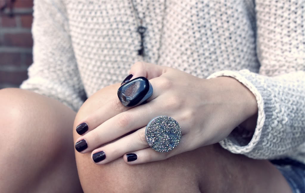
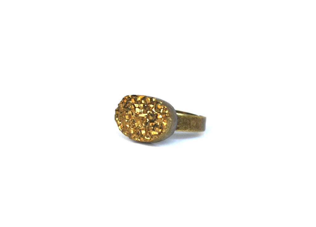
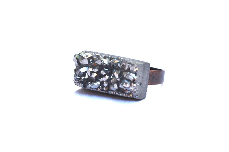
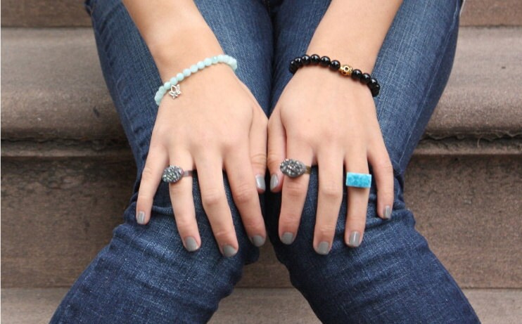
Drooooozy on etsy
My amazing new iPhone lens

There were several people in my Souvenir Foto School who took all of their photos on their iPhone, and they were amazing, quality shots. I learned so much about the great iPhone apps out there for photographers (did you know you can get photoshop on your phone for free?). So far I have downloaded Camera+ and PicFrame, and will be looking at a few more. I also learned about this cool lens for the phone. It attached by a magnet that you stick on the phone, and has a wide angle and macro lens attached. It was only $20 from Photojojo, and it got here really fast! Plus they included a "stowaway dinosaur" plastic dinosaur with the shipment and the boys were THRILLED. :)


I had a little lemon tree...


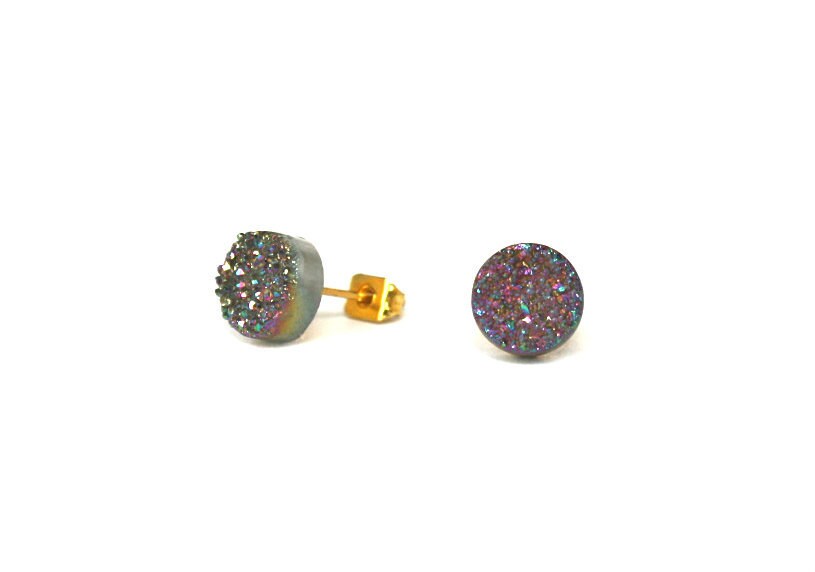
Junghwa giveaway winner!
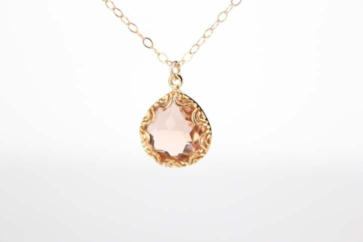

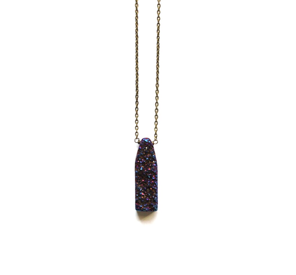
For the rest of us, the consolation can be that Amy has more in her Etsy store - and they don't break the bank. :)
Thanks to Amy for the necklace, and thank you to everyone who entered - I appreciate you stopping by my little blog! There will be more giveaways to come, so check back again soon. Happy Monday!
Fun with Fonts: Lost Type Co-op

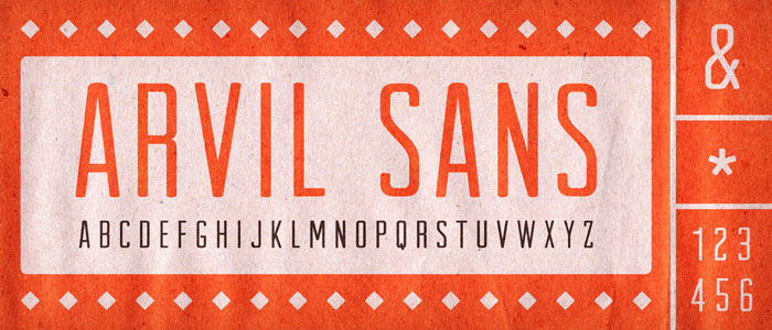
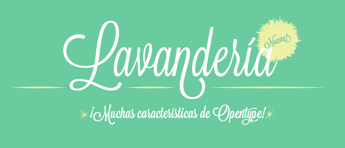

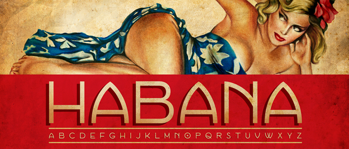
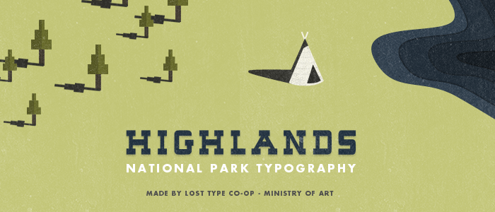
So tell me, do you have a go-to site for fab fonts?
Photo School V to Z
 |
| V is for Valentine |
 |
| W is for Wedding Ring |
 |
| W is for White Wine |
 |
| X is for X-amining the Menu (yes, I know it isn't REALLY...) |
 |
| Y is for Y-Stick (we have a collection...) |
 |
| Z is for Zzzzzzzzzs |
Subscribe to:
Posts (Atom)